This blog post is about a branding project we delivered for Janice Clare, positioning her business as People Positive. We will explore the thinking and share some of the communications we developed within this solution.
Background to the coaching sector
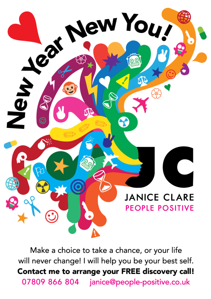
Coaching is all about people, when Janice asked us to develop the identity for her corporate coaching business I felt there was a real opportunity to create something that not only reflected her personality and approach, but also her values – people.
Coaching and continued professional development (CPD) covers a wide scope of activities, services and disciplines, most of the businesses operating with this space use illustrations, allowing for the broadest interpretation of the image with the audience.
This all makes a lot of sense, but brings with it some problems. The trouble with this follow-the-herd approach is it creates a world of ‘me-too’s’ where everyone is using similar illustrative styles (often the same style with minor colour tweaks) and the business becomes lost in a sea of the sameness with no memorable features.
How to solve the stand-out problem?
Facing this challenge, and the need to create something that was scalable we looked at what other visual interpretations there were for people. Our research took us into art and how artists throughout time have represented the human form.
It’s a fine balance, because when you look at artists and in particular abstract artists, there’s a point at which the work becomes so abstract it could be almost anything when viewed out of context. Which doesn’t help us to solve the problem.
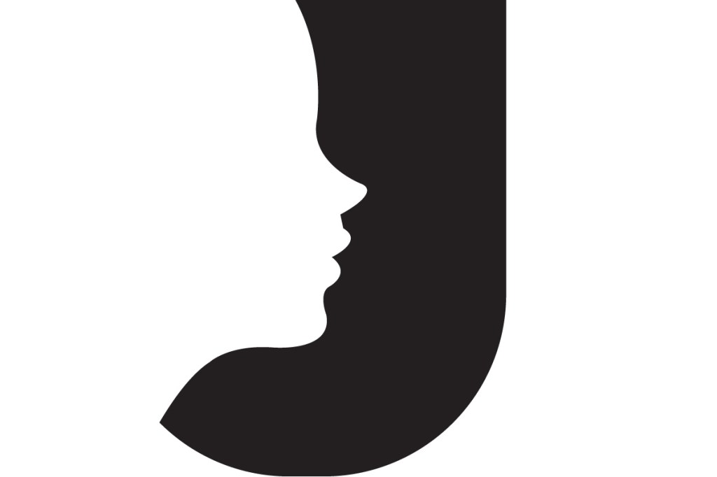
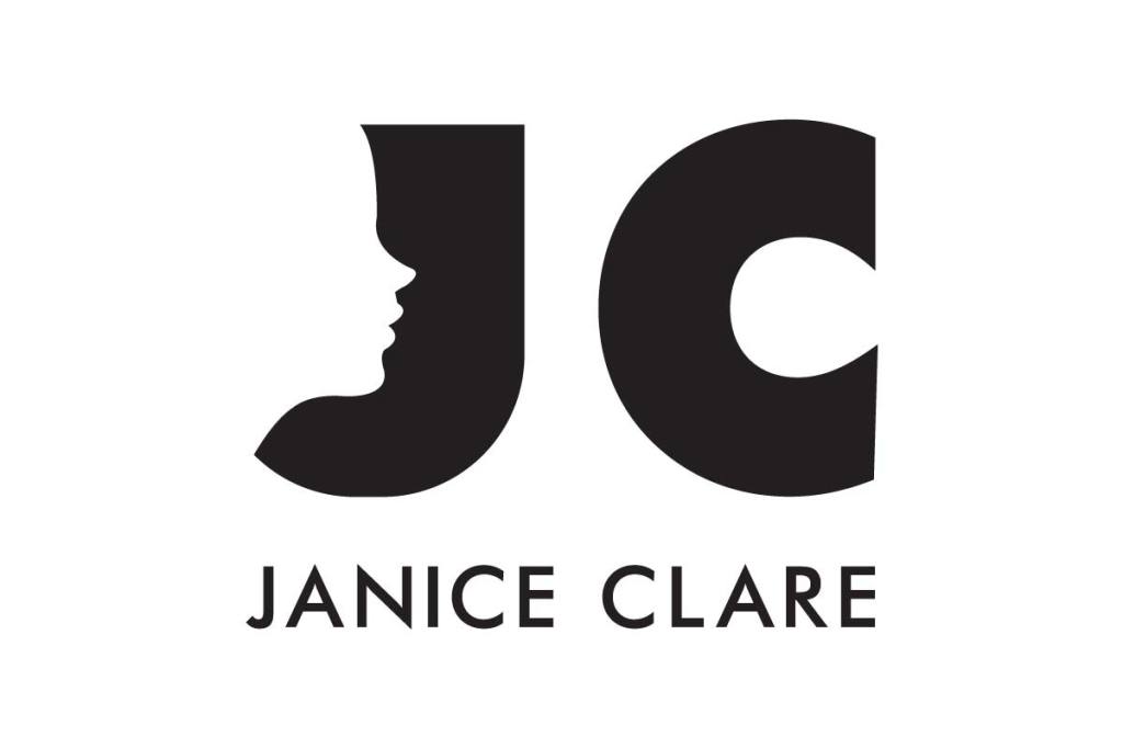
After further visual research we decided that there was an opportunity in silhouettes. These graphic styles strike the right balance between anonymity and character driven images. At first glance we can often think of them being incredibly stylised, but upon closer inspection we see a lot of personal detail in these forms without them feeling too prescriptive.
This allowed to graphics to strike the right balance of professionalism and inclusivity. The silhouettes are also incredibly versatile, graphically speaking there is a lot that we can do with them across a wide range of media.
The typographic challenge
Within the brand identity we needed to use Janice’s name and create a positioning line for the business, both of which would sit alongside whatever visual icon or graphic we created.
I spent a lot of time looking at fonts and type forms to see if there was something that lent itself naturally to the subject and the human facial form in silhouette.
Of course there are some ‘fun fonts’ that use people to make letters etc, think Matisse’s cut paper work and you soon get the idea, but that image wasn’t right here. Janice’s work is with large corporate organisations, therefore the identity needed to have the gravitas to be at home within that environment.
So we started to experiment with the ‘J’ and ‘C’ letterforms to see if there was something that could work. I’m a big fan of negative space within all aspects of design and I figured that there was a way in which we could subtly adjust the negative space within the ‘J’ letterform to get a persons face into it.

This look some time, experimenting with fonts to see what would work and give us the basis for a full identity. For example, it was no good selecting a font that only has 1 or 2 weights, a font where there’s regular and bold for example simply doesn’t provide enough breadth for any documentation or reports that would need to be created.
I think that this is something that isn’t talked about enough within brand development. The choice of fonts, how they work with and support (yes they are an integral part of creating a visually cohesive solution).
The positioning line
The best pieces of brand positioning are simple and clear. That means, typically 2 to 3 words, maybe 4 at the absolute max. Time to start thumbing through the research again, see what words and phrases popped up and what terminology we should be using. People was an obvious part, adding a second ‘P’ for the alliteration felt right, enter ‘positive’. Creating the line, ‘people positive’. It says everything, it can be interpretated many ways and it’s inclusive.
Aligned thinking
Having arrived at an identity that we felt was particularly strong and appropriate we shared this with Janice. To my delight, she shared the love of what were had created, and still does to this day. We ran her through our thinking, why we had done what we’d done, the thinking and the potential to expand the identity across all manner of applications.
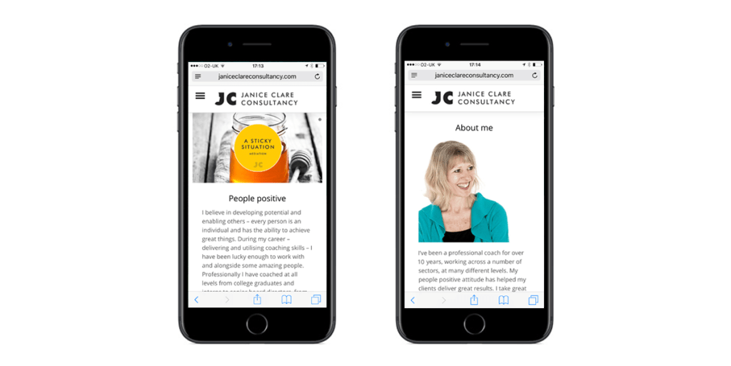
We also proposed using photographs in contrast to the majority of the competition. But these weren’t just any old photo or person, they were a deliberate mix of dynamic and calming images, things that would chime with people looking to work on various aspects of themselves.
Update 2024! Happy clients and happy customers
We were thrilled when Janice came back to us, looking to expand her offering within a specific location. Andy asked her how the work we have produced has been received, “I love it and the people I work with love it. It’s stood the test of time really well”
Hearing this from Janice is wonderful, and we have enjoyed developing Janice’s latest product offering.
The Janice Clare brand identity is just one example of the work we produce – the research, thinking and development that sits behind what you might see as a customer.
Our work always centres upon the same statement, “Is it human?”
All our work seeks to create rich, human connections between people and products or services. If you’d like to know more about what we do, contact us.
