There’s a common thread to a lot of the work that we develop for our clients, it involves creating a highly professional brand, with all the associated strategy and marketing, for companies that are actually much smaller than they appear.
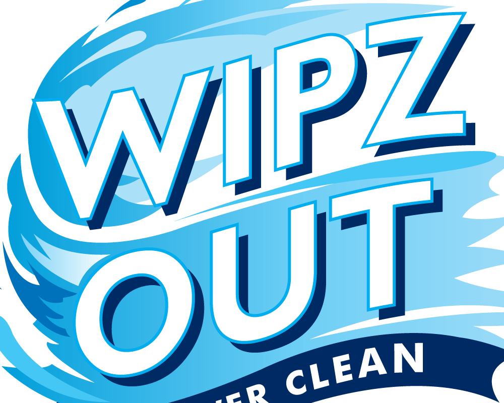
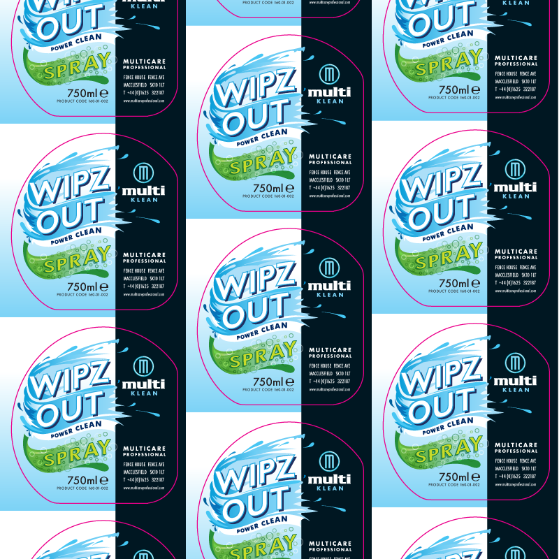
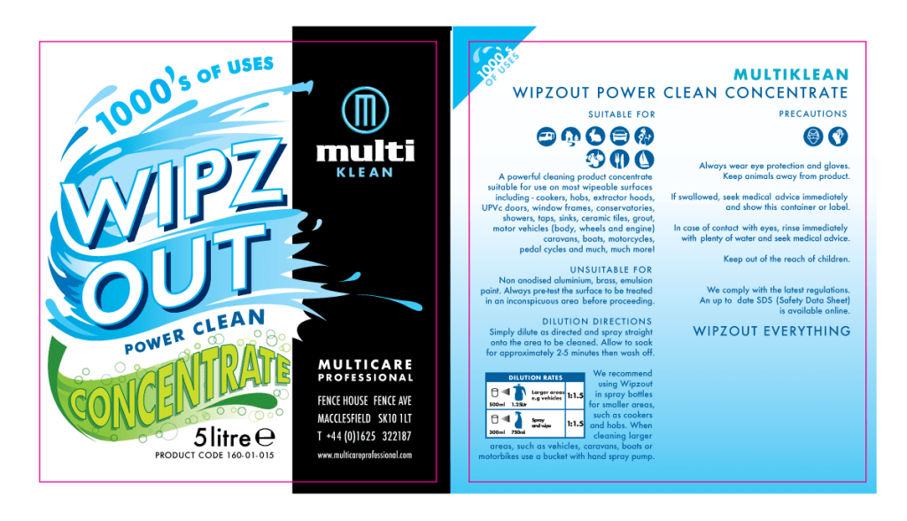
Wipzout is an extension of a successful B-2-B cleaning business – Multicare Professional – a company well versed in the beauty sector. They have decades of experience and produce all kinds of cleaning solutions.
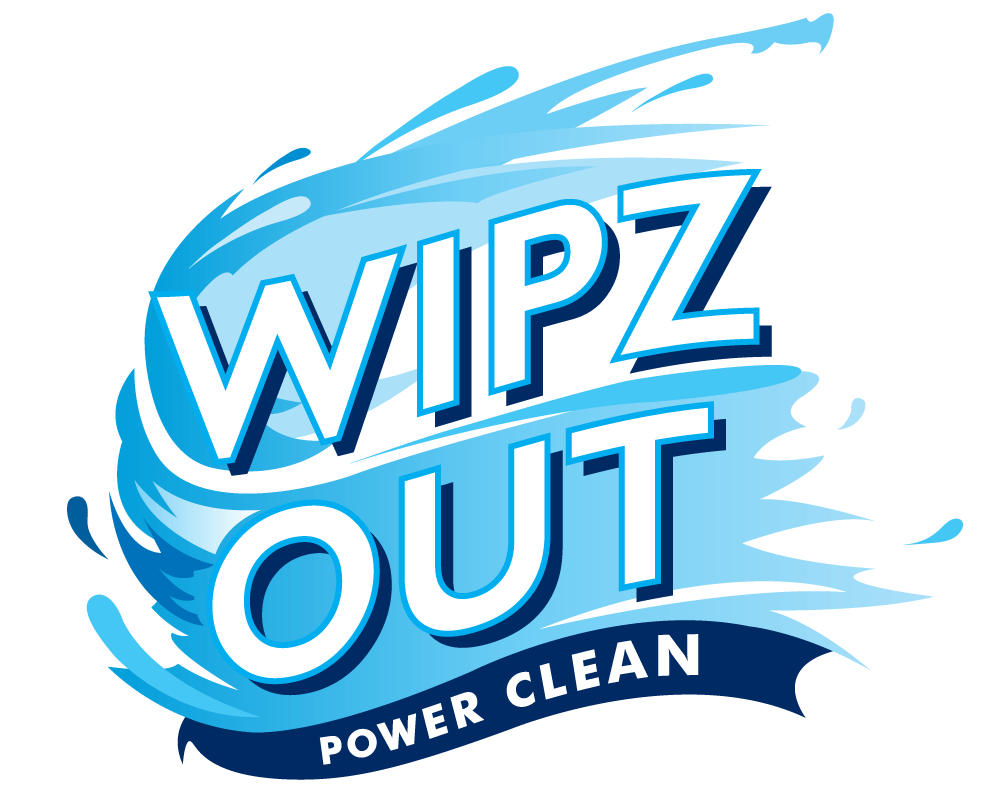
The management team at Multicare wanted to broaden the appeal of their products, use their knowledge and repackage it into a consumer facing brand that could sit alongside the market leaders. This was where we came in, developing the Wipzout brand. Below are some of the steps involved with realising the vision of a FMCG product.
Time to play the name game
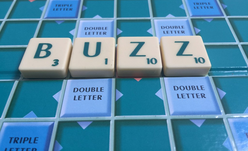
This is central to almost everything that we do. What you call something is the corner stone upon which everything else is built. Get this right and you have something human to explore with other people – your customers, creating a buzz.
How do we play the game? We start with research, undertaking a lot of research into the sector, so that we are aware of language, tone-of-voice and other influencing factors. Then we set about looking for opportunities, expressions and language that’s not already used within the space. What words, phrases and emotions fit, and of course, what doesn’t.
It’s important to try these out on others – people who aren’t working on the project, this is where your segmentation and customer persona’s really come into play, knowing where the sweet spot lies enables you to check and refine. Social channels and social listening are extremely useful here. These methods allow you to test ideas and vocabulary before committing. They also allow you to demonstrate why certain expressions are a better fit than others – useful when presenting this work to the clients.
Sifting and refining
By this point we have a short list of brand names, some with, other without a positioning. Some of the names will naturally feel more appropriate than others, this is where a detailed brief, clear customer persona’s/segmentation really comes into its own, removing the guess work.
This is also the point at which we can really start to flex our creative muscles, moving beyond words and phrases into visual expressions. How we visualise these names, what shapes we use, the typography and icons or characters associated with them. I am a big advocate of using pen and paper here. Ultimately this will be produced on a computer, but pen and paper is quicker and more versatile, the thinking needs to be broad and free, computers can narrow the focus and reduce the creativity if introduced too early during this process.
Plus we can quickly work up visuals by hand, much faster than any software, get them into a presentable format and start to engage with the client team about our thinking. I firmly believe that these lose sketches also allow for a better conversation. Here’s why – when we see a computer render or visual our mind automatically jumps, making the assumption that this is the complete and finished article.
That’s not where we are at, not yet anyway, right now we want to continue the exploration and sketches complete with mood boards. This combination fosters collaboration and workshopping. Allowing everyone to get involved – making suggestions and feeling engaged with the development, rather than being asked to make decisions about what can look like fully finished items.
Agreed focus
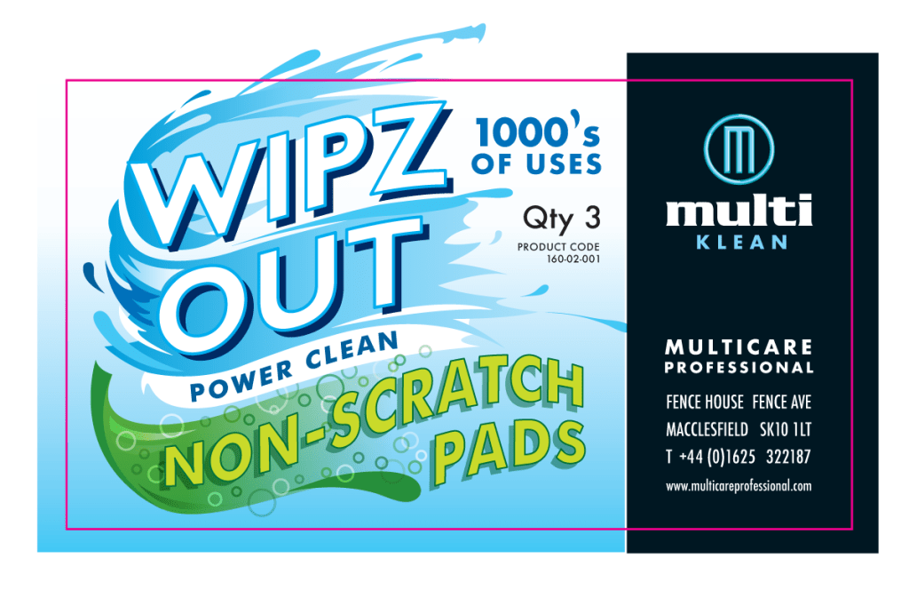
This is the next stage, we have a consensus, an agreed direction, possibly some colours and icons or other shapes from which to work. It’s also at this stage that we’ll start getting into the nitty gritty of the technical delivery of the brand, especially within FMCG, where there can be all kinds of print limitations, material choices to be made and broader packaging principles to be explored.

We need to have these conversations at this stage to ensure what we design can be realised in a practical and cost-effective manner. This is also the stage where we will begin work on the computer, drawing up characters or type ideas, exploring how they work with cutting guides (the label shape or box shape guide). It’s also the stage where all the other technical details will be shared with us, such as barcodes, nutrition and safety information including any regulatory rules that we must adhere to.
Refining and thinking about the future
Projects like Wipzout often start as a single stand-alone product or idea. We always take the view that this could expand, so we develop our designs to accommodate potential range expansion. Sometimes this happens quickly, other times they can be a lot further down the line, but knowing we have built-in the structures to support them is invaluable. It saves cost and builds on what has come before, rather than adapting things to fit.

All of these stages feed into brand guidelines, which simply cannot be created until we have begun developing the range. It’s here that we advise clients to think about the intellectual property registration processes – something we’re happy to support customers with – as there is usually a great deal of graphic information required, not just the logo or mark, but the colours and other technical details in order to apply for copyright protection and IP.
Back stage pass
This is a very quick and informal run through the work that’s involved with developing consumer brands within the FMCG space. We’ve shared it to help other people who may not have as much experience understand more about our processes and attention to detail.
If this, or any of the other work found within this site are of interest to you, I’d love to chat, I’m passionate about the work and always happy to share insights with others. As always, there is no pressure or expectation. Thanks for reading.
