We love a challenge, especially and visual one. The challenge sounded straightforward enough. The client wanted to develop a brand identity that would express the values and working dynamics of the Saunders & Lee business. Ok that all sounds very do-able, until…there has to be an equal balance within the identity for both names. Oooh here’s the tricky bit, balancing the eight letter and three letter names, creating something that feels equitable.
Typographic challenge accepted
If you have any interest in typography you will know that a ‘S’ and a ‘L’ letterform are not happy bedfellows. If you’re reading this and wondering what the f-yuck I’m talking about. Here’s a brief explanation.
The S letter form – it’s all about curves, very round and flowing
The L letter form – is the total opposite of the S, no matter what the font, even in the most flowing of handwriting fonts (which most people find really hard to read) there are still stark contrasts between these two shapes, the L is close to on a 90 degree angle, sharp and linear.

What could we do?
Explore the shapes, break them down in to there most abstract components and see if there was a way to create harmony where there was none (visually speaking).
The solution
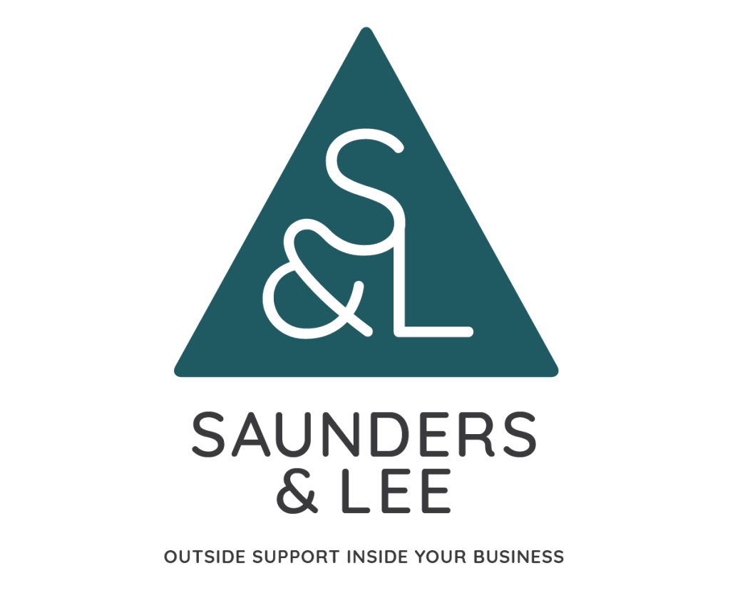
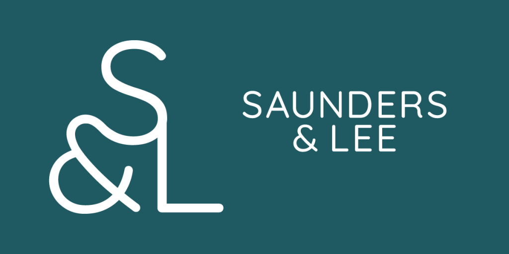
The solution came in the form of the ampersand (typographic name for the ‘and’ symbol within a font). This element created a bridge that could join these two letterforms together in a way that didn’t feel forced (visually). It also led itself nicely towards the use of a triangular shape within which these could sit, creating a graphic element that had a strong visual presence even when used small on applications such as social channels, stationary or digital documentation.
Colour palette
The greatest test of any identity work is black and white. This is as simple and paired back as you’re ever likely to get, if an idea works when it’s reproduced small in black and white then it has the ability to expand and be used in many, many other ways.
The work carried out by Saunders and Lee would be classified as B2B professional services and support systems – they do a lot of the behind the scenes work that helps businesses function smoothly, think of them as the swan’s feet, paddling like crazy beneath the surface of the water, whilst the swan glides elegantly past. Their clients value these services, the knowledge and understanding of the S&L team, it’s all about trust and professionalism, therefore going bright and vibrant wasn’t really going to work here.
Yes it would stand out, but it wouldn’t have the gravitas the directors needed to ensure that the clients had that confidence in the delivery of a wide range of services.
Positioning line
The services provided by S&L is wide ranging and often bespoke. How do you position a business that does lots of things, often quite technical, for businesses in the background, kind of secret weapon style?
We chose to use the word ‘consultants’, as this word elevates and correctly positions the knowledge base and skills of the team with the audience. We joined this up with ‘Administrative’ to give Saunders & Lee Administrative Consultants.
A name that has the gravitas of the large corporate businesses they support, the visual balance of the names that was so important to the client, and the versatility to be used across a wide range of media, in many sizes and formats.
This is just one example of the work we, the Busy as AB team, produce from clients. The research, analysis, thinking and development that sits behind what you might call a customer and the customer journey.
This work always centres upon the same statement, “Is it human?”.
All our work seeks to create rich, human connections between people and products or services. If you’d like to know more about what we do, contact us.
