This is a blog post about the Moyes Investments identity, developed by the Busy as AB team.
Sector trends
Financial services and investments are awash with visual and verbal metaphors for happiness and success. In recent times, these visuals have become much more inclusive and attempted to broaden the appeal of financial planning and investments to a wider demographic. Part of this development has seen the visuals become much more informal.
The larger operators within this sector are global institutions with long histories within the field. They are very professional, but they also lack any real sense of who they are. As many businesses scale they lose what has been central to their success, the humanity and personal approach. They then trade on size, experience and the ability to put large budgets behind national and international ad campaigns so that we, their potential audience, see them in lots of places, can remember the names and that recall brings them business.
Client introduction
Our work with the team a Moyes was different, they are different – a small finely-honed team with an extremely impressive set of skills and knowledge. Backed up with a genuine down to earth approach and humility that is refreshing.
We spent time with the directors, learning about the business and understanding their customer’s journey – the things that make Moyes different from other providers. We also looked at customer profiles, who were the existing customers and what did they like about the business? All useful information to ensure that the strategic marketing direction of the business is aligned with past experience and the desires for the future.
Developing the visual narrative
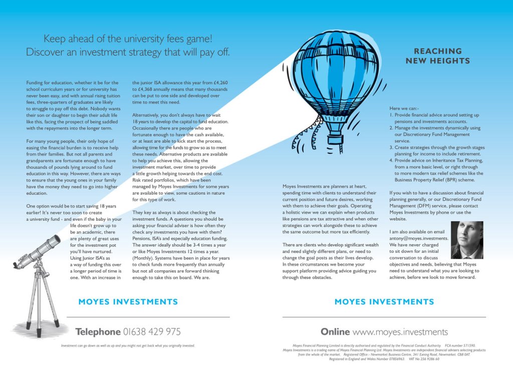
Flight and air travel was a massive part of the founders life, he has served in the Royal Airforce and still has a strong interest in all things aeronautic. It was important to him and his team to have visual assets for the business that reflected where they have come from, and something that would make them different.
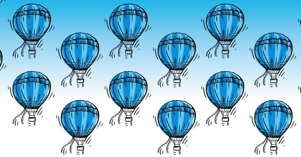
Time to fly
We explored a number of visualisations of flying and flight, looking at animals and nature as well as the human endeavours. It’s a fact of life that everything that goes into flight has to come back to ground at some point, usually to refuel or feed. There were some concerns from the Moyes team about this aspect of using the flight visual language for the business, they wanted to project a positive flight story.
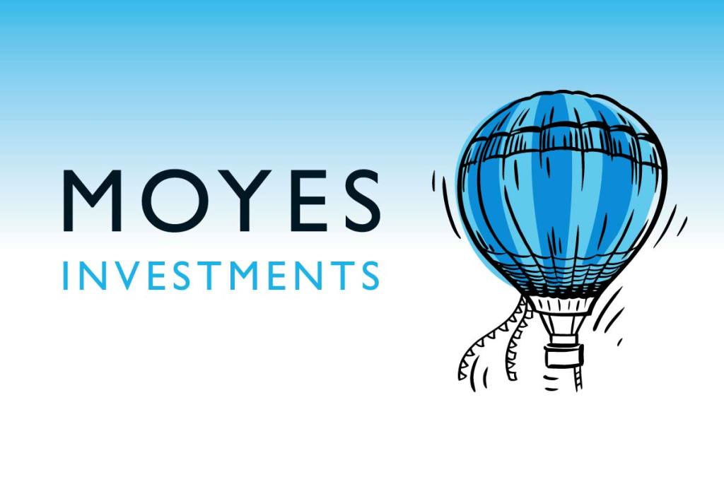
We listened to the feedback and invested more time exploring what made Moyes different from the competition. This reaffirmed what we already knew. Customers came to Moyes Investments and stayed with them because of their honesty and the feeling of being in a ‘safe pair of hands’.
This trust goes hand-in-hand with hot air ballooning, where the journey up for the passengers is exhilarating but also very carefully controlled – conducted when the conditions are just right. It’s also a physical, manual experience, the pilot uses knowledge and expertise to precisely manoeuvre these huge balloons.

Coming back to the teams concerns, in particular the ‘decent’ aspects, looking closely at a hot air balloon ride this is slow and finely controlled, should the worse happen, and you have to land, you trust the pilot to keep you safe from harm, able to read the world around them before you are in danger. All of these sentiments echoed well with the Moyes approach to financial services.
Consistency, consistency, consistency
With the visual identity agreed, it was then our job to apply it consistently – both visually and with tone of voice – across the business, across digital assets such as the website, email, spreadsheets and other digital documentation but also into physical hand-over pieces – folders, document wallets and of course stationery.
Building brand awareness
During the course of our time working with Moyes we have also run strategic brand awareness and advertorial campaigns within select publications, ensuring that the business always presents clearly, with human values and a visual consistency. The level of which you would expect from the bigger players because this builds confidence, but we also do something else, creating a design language and an approachability that feels personable – hence the hand drawn woodcut illustration, which lies at the centre of the brand.
This is just one example of the work we, the Busy as AB team, produce from clients. The research, analysis, thinking and development that sits behind what you might see as a customer. This work always centres upon the same statement, “Is it human?”.
All our work seeks to create rich, human connections between people and products or services. If you’d like to know more about what we do, contact us.
