
Branding support for other creatives
Welcome back to the blog, in this post we are looking at designing for designers. Over the years there have been a number of designers, working in various disciplines, who have come to us for help developing their own brand.
It’s time to share some of these projects and explain the processes behind them – paying particular attention to the humanisation and creative thinking that sits within each and every solution.
I will also explore why conveying these emotions is so important and how these brand emotions – tone of voice and the visual narrative play out into the wider areas of the businesses that we have supported.
The hardest job in the world
This is how many designers describe creating their own brand. To an extent I’d agree, it can be very hard to design your own ‘stuff’. I’d mainly attribute this to the personal pressure that you place upon yourself to excel in every aspect of the solution. I’m 100% sure that there are harder jobs, but I can empathise as well.
Most designers are not comfortable in the limelight, myself included, preferring to be behind the scenes. We can often feel personally judged by the work – what people see and what that visual says to them is probably the most important aspect of any designers business. Knowing and understanding these invisible forces probably doesn’t help a lot of folks when it comes to developing their own brand.
When you’re working within a sector where creating the right image is everything, the whole process can quickly become extremely pressured and that can be very debilitating.
I totally get that. An external, fresh set of eyes is often sharper, more able to see the opportunities and bring fresh thinking into a business – it’s what we’ve been doing for years. The bee team have worked with lots of people and businesses, creating brands, but this post is all about the brand identities we have created for other designers. It’s time to share 6 of them with you:-
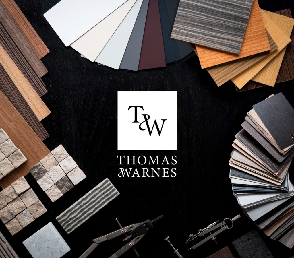
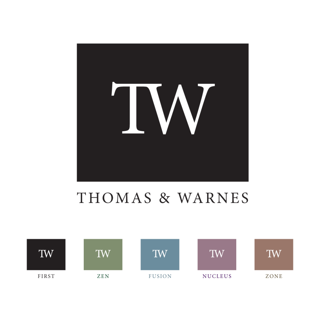
Thomas & Warnes
Who?
Founded by a furniture designer, Jane Thomas and an audio visual technology visionary, Matthew Warnes.
What?
T&W make beautifully hand-crafted furniture that is packed with hidden, state of the art technology.
Where?
T&W work with prestigious hospitality venues, high net-worth individuals and celebrities to create unique interior spaces. These include hotels, restaurants, spa’s, home cinema’s, entire homes, boats and even aircraft.
Thomas and Warnes – the brief
T&W work with an exclusive group of individuals and companies. They offer a highly bespoke service, using some of the most intricate techniques and materials to create furniture that looks visually amazing with incredible functionality hidden within it. The T&W team wanted a brand icon that could easily be applied to their products and used across all communication channels.
Thomas and Warnes – the creative ideas
The letterforms T and W are challenging. Why? Let me explain, when working with businesses who have equal partners it is very important that the equality is demonstrated within the brand identity. Within these two letterforms there are a lot of vertical and horizontal bold, quite aggressive, angled lines. For this reason, these two letters do not sit comfortably next to one another without a change in scale for one or the other.
We focused on ways to join them, exploring many font combinations and delving deep into the extended font families, looking at the ligatures (joined letterforms) and font construction – ascenders/decenders, serif size and shape for inspiration. We then set about developing a visual bridge that could bring them together, creating visual harmony where there was none (see comments above about these letterforms). We also wanted to create something unique, and explored many typographic flourishes and styles before arriving at what felt like a good fit for the client.
Thomas and Warnes – the brand rollout
The T&W brand identity was rolled out across events, products and places including a number of digital/social channels. The work included printed literature and ads for publications. As a audio visual business there was a need for video and animation too. Other aspects of this project included signage, livery, uniforms and product packaging.
Why the Thomas and Warnes brand identity works
Bringing in the ampersand flourish, joining the two serif letterforms created a marque that feels both established and approachable. It also delivered equality for the founders.
Established. First and foremost there is a strong echo of classical typography and visual balance that has been adhered to since the earliest days of publishing. We have maintained all the strength, angularity and power of the letters.
Approachable. Adding a vibrant flourish brings energy and vibrancy. It breaks the conformity and rigidity of ‘old, established type’ bringing a balance of connection into the visual. A ying to the yang of the hard and sharp complimented with the flowing, soft shape of the curved ampersand.
As one of the T&W directors pointed out, “The T&W identity also resembles a hall-marque – the small makers marks found on jewellery”. The T&W team agreed, they very much see their furniture as a close creative relation to jewellery – every bit as intricate and personalised.
Harmony
Who?
Harmony Design Studio
What?
A small, bespoke agency founded by Linda Jeanott
Where?
The work produced is inspired by ‘musical balance’. Bringing together various ‘instruments’ to create beautiful experiences and communication that flows.
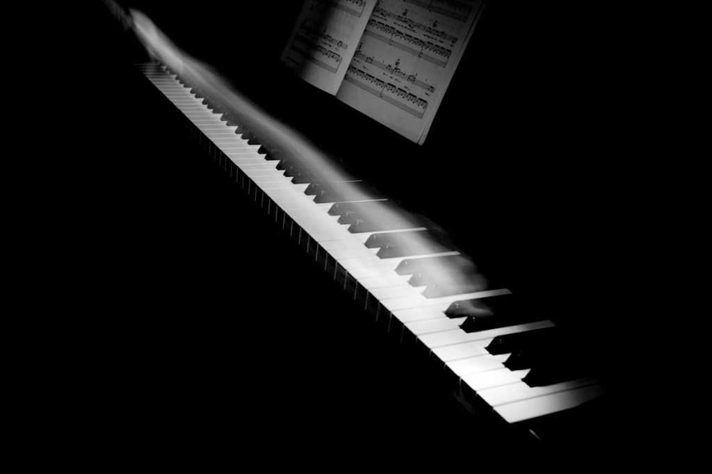
Harmony – the brief
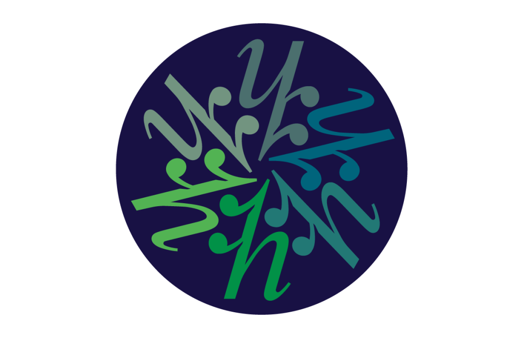
Linda shared a number of music videos with us and explained why she felt that they were important. The parallels between music and design direction are very strong and when Linda told us that the name for the business was to be ‘harmony’, I could already tell that this would be a strong and relatable brand. The challenge, and why we had been brought in, was to create a brand icon that could communicate the complexity and intricacy of harmonic music and design in a simple, stylish graphic.
Harmony – the creative ideas
We began by researching musical notes and notation. There are many similarities with typography, the two systems feel very closely linked. We looked at all of the various musical notation symbols to see if there were any potential areas of cross-over or inference. This kind visual play only works if the symbol you are using is widely recognised, for most people, the only aspect of written music that we ‘know’ and recognise, are the notes themselves – the black dots on the horizontal lines, with or without sticks to the top or bottom.
These notes can be very straight and angular, which I believed could work well with a capital H letterform, especially if we used a serif font. But this could also be a little too subtle and maybe too formal? Harmony is the combination of musical notes played together as chords – we needed to visually achieve this.
Music has a natural flow, a rigid, vertical H, whether uppercase or lowercase, doesn’t have any flow, it’s solid, hard and angular. Thankfully the italic versions of many serif fonts do have ‘flow’ and this instantly made the whole thing feel more approachable…and much more personable.
Harmony brand rollout
When designing for designers we know that there is going to be a lot of applications required for the identity. The nature of design work means that no two jobs are the same, everything is bespoke. And this was very much the case here. We needed to explore how the brand identity would be used across a lot of media. The obvious starting points were digital platforms and channels, print and promotional materials. We methodically worked these through in order to arrive at a brand guide that covered as many eventualities as we could foresee at that moment.
Why the Harmony brand identity works
It’s instant. The ‘h’ is instantly understood and the double dots, or tie to use a musical term, leads you into the shape. The italic ‘h’ has a lovely, warm flow to it and there’s a good vibe coming from the whole thing. The angle of the additions to the ‘h’ flow with the letters shape. The counters, the small indents that sit underneath each stroke draw your eye across the shape in a smooth upward curve, followed by a sharp drop and an onward smooth lift – mimicking the shapes ‘drawn’ by a conductor.
As always the most important person is the client, especially a fellow designer, so I am thrilled to say that Linda was over the moon with the Harmony brand identity. Of course she challenged us along the way – I wouldn’t have expected anything less. I also feel that we really connected, sharing our views, keeping our minds open to what could be and when we found it, acknowledged the right solution.
Feilden and Mawson
Who?
Feilden and Mawson are commercial architects with offices across the UK and Europe. Like many architecture businesses the scope of their projects often extends into designing the interior space as well as the exterior. The team at F&M wanted to create a brand that could stand independently, able to support the F&M projects but also able to work with other architects (individuals and groups) who don’t have a dedicated interiors team.
What?
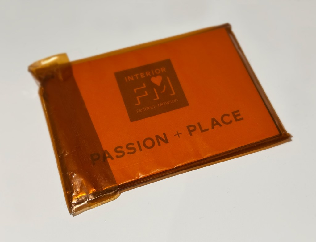
The interior design service needed it’s own name. The connection to F&M needed to be clear, and so Interior FM was born.
Where?
Interior FM works with a broad range of businesses and organisations in both supportive roles to the main architects, but also as an independent, interior design consultancy in it’s own right.
Interior FM creative ideas
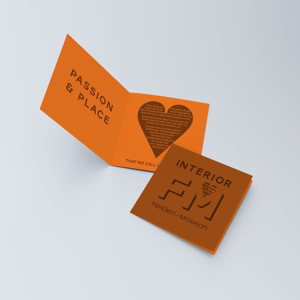
I’m a big fan of negative space within design. It’s part of the less is more model that very much appeals to me because it engages people – what you see and the messages that vision sends to your brain. When negative space is used within a design, there is always an ‘aha’ moment when the viewer recognises the visual trick that is being used. That moment is also a powerful, humanised connection. A shared experience and a moment of joy for the viewer as they see the deeper meaning within the thing that they were drawn to, but were perhaps not totally sure about what it was saying to them. This is a huge simplification, and something that happens in nano seconds, but it should never be ignored. The design has connected with the viewer, the shapes and construction have elicited a response, usually a smile, from a person who was until very recently totally unconnected to the business or brand.
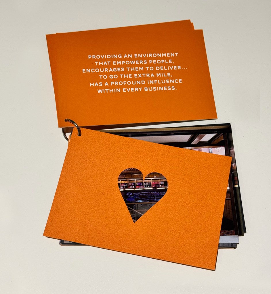
Much as I love negative space within design, you cannot force it. It has to come naturally and be easy for others to understand – the people who know nothing about what you do. People who are seeing this for the very first time. With this project there was, to me at least, an obvious place to add some negative space that would say a lot about the brand.
The heart icon is probably one of the greatest pieces of branding produced in my opinion. This stylised graphic has little to do with the real shape and function of the heart, but it has become synonymous with it. The emoji (and all it’s variants) is one of the most frequently used ways to express joy and happiness in the digital world. But the actual icon really came to prominence way before we had computers – my ‘Heart is a brand’ blog post charts the full story.
Negative space also allowed us to express a sense of an environment – the man-made shapes and objects that we put within them to create our living spaces.
Interior FM brand launch and rollout
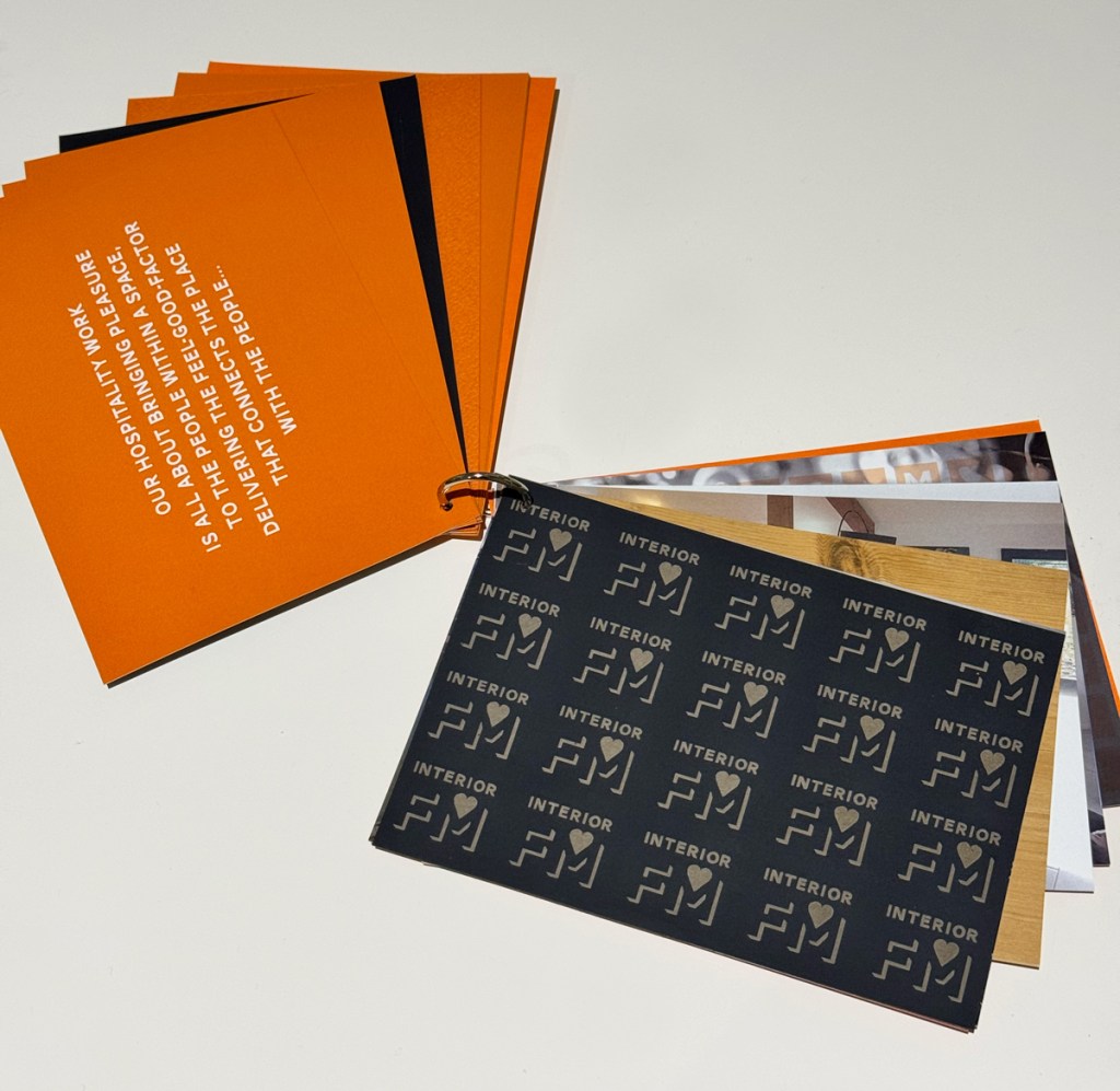
Interior FM was launched by Feilden+Mawson at an event in Cambridge. It marked an important milestone in the companies history, proudly declaring that interior design was every bit as much a part of the F+M business as the building designs themselves.
In person events are wonderful ways to connect with people. In this case we created a series of postcards using various textures and printing techniques that challenged and embraced what interior design delivers.
At this point I’m going to have to admit to being a fully paid-up member of the paper sniffer club! Much as we all spend a lot of time within the digital spaces, physical print, textures, papers and finishes always feels special to me. These postcards, and the envelopes that held them, were an opportunity to demonstrate the design prowess of the F+M business.
I attended the launch and it was great to see people exploring the postcards. They were very much a talking point that piqued everyone’s interest and started people talking about Interior FM in ways that I’m not sure digital media could TBH.
Having teased people with what Interior FM was and what it would bring, the design director gave a short presentation about the new brand. We kept this really simple, a couple of slides about the values and experience, alongside screen grabs from the new website (we’d also delivered). The pivotal moment came as the director finished his presentation and he, along with the rest of the Interior FM team asked who wanted a business card? That might sound strange, maybe even arrogant? But there was a very good reason for this. We had designed the cards to be another talking point, using the identity to shape the cards, creating something that was itself very memorable and expressed a great deal about what the business produced.
Upon hearing the question raised, people were curious, and as the first few took hold of the respective cards with ‘wow’s and ‘ooohhhs’ there was very quickly a clamour to see what it was about these cards that was special. And that, epitomises the ‘human connection’ that I talk about in many of my posts and in all of the branding work that we deliver. Great branding connects with people on lots of levels.
Why the Interior FM brand works
The Interior FM identity works because it’s multi-faceted. The design allows people to explore what the business means to them. The identity expresses the services in novel and interesting ways. In short, it’s different, both in the brand thinking and the way it communicates it’s values. This gets peoples attention, it makes connections and creates a buzz.
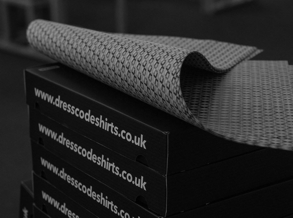
DressCode
Who?
Founded by me, DressCode was a real test of my skills, both developing the brand and the products, but it was also a lot of fun.
What?
DressCode make hand-crafted shirts that express technology themes within the designs. DressCode was the first company to offer contactless payments from an item of clothing, a service I called CashCuff.
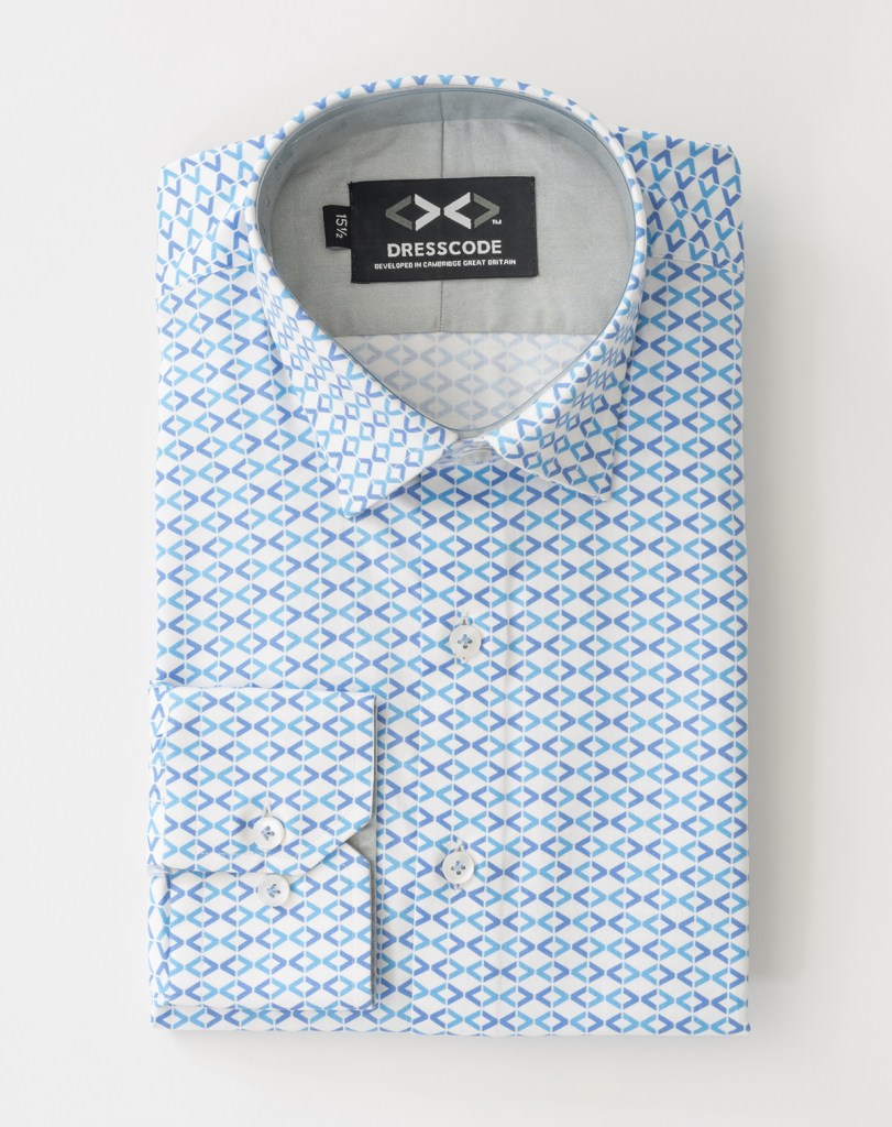
Where?
DressCode is an e-commerce business, operating virtually, supported by in-person events, networking and through it’s support of slow fashion movements, working with organisations such as the British Antarctic Survey and COP.
DressCode – the brief
Simplicity was key. Less is more. Something that would look stylish but also share some of this inner geekery (found within the designs of the garments) with those who know and have passions for the tech space.
DressCode brand rollout
I have already charted many aspects of the DressCode brand both within this blog and through the DressCode blog. Here are a few links – Why DressCode? ReCode – The DressCode upcycling programme
Why the DressCode brand works
It’s simple and clear. The D and C are instantly recognisable. Then there are the other levels, the things that different people see, at different times. The angled brackets of code for example…or the bow tie. There’s more than one way into this brand and that has been incredibly important.
In a time when people can discover what you do through many channels and media, DressCode stands out. A big part of this is the consistency in the branding, the adaptability of the identity across many kinds of media – from the physical stitching within a shirt through all the digital channels. The identity remains simple and clear wherever you discover it.
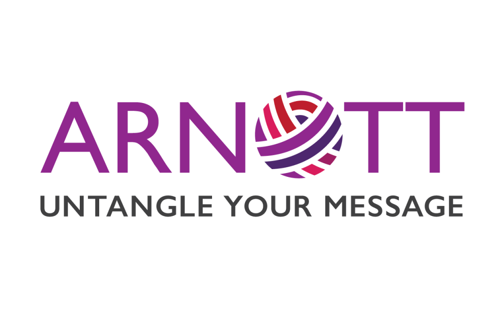
Karen Arnott
Who?
Karen Arnott is a web designer, based just outside Cambridge. Karen has lots of experience across both print and digital platforms.
What?
Karen offers design services and marketing support.
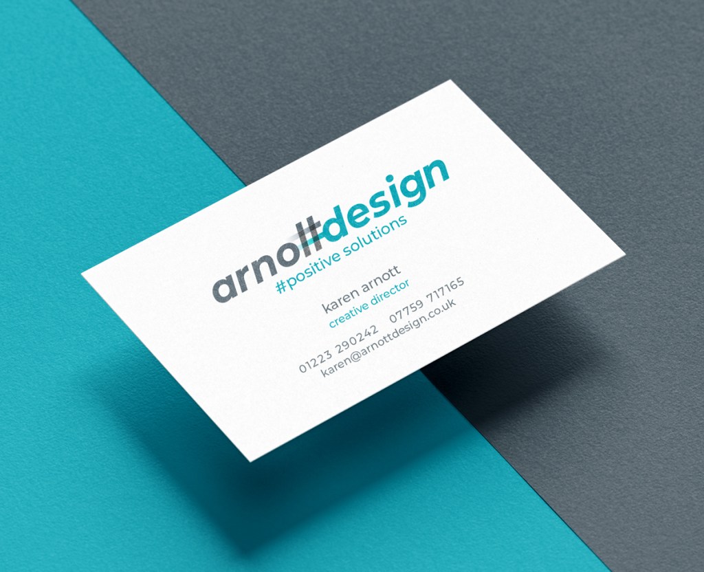
Where?
Karen works with various businesses, her focus is the online web space, designing and building sites to communicate with customers.
Karen Arnott brand briefing
Remember in the intro to this blog, I mentioned that personal, or self-branding, is one of the hardest tasks for many designers. Karen already had an identity that she had used for some time. She wanted to update it, but found it difficult to separate this task from the day-to-day of running the business. There was always something else demanding her time, fighting for her attention. So she asked if we could help.
Karen’s business is rooted in web services. She felt that her brand should reflect that. We had a couple of discovery calls to explore the main motivations and the areas of expertise that she wanted to connect with her business. This formed the core of Karen’s brief to us.
KA Design – creative ideas
We start with the obvious – the name. Looking at the letterforms and whether there are any visual games we can play with key elements. In this case, we have two dynamic, strong letterforms when thinking about the uppercase K and A. Can they compliment one another? Or do they fight for attention?
Let’s look at things from a different perspective. When we take things into lowercase letterforms things soften dramatically. Suddenly the feel is much more approachable. It’s friendlier and gives warmth and personality that we don’t get from them in uppercase.
Next up is to look at common web elements, is there something that we can introduce into the letterforms that is easily recognised? A web icon or graphic? It was whilst we were in this phase of the work that I started to develop a thought around the double ‘t’ in Arnott. It felt to me that there was the possibility to blend this shape with a hashtag, or should I say replace the t’s with a hashtag symbol and (most importantly) retain the readability of the word.
I don’t want to preach, but the best designs are simple. They bring together elements that feel like they have a natural affinity when you see them together, though you have probably never seen them together before now. And that’s another important aspect, originality. Being the first is about cementing a connection with people, originality does that there simply is no substitute. Businesses that copy and follows trends sit at a completely different level of connection for me, they aren’t original, and that is a very clear demonstration of the values that sit within the business.
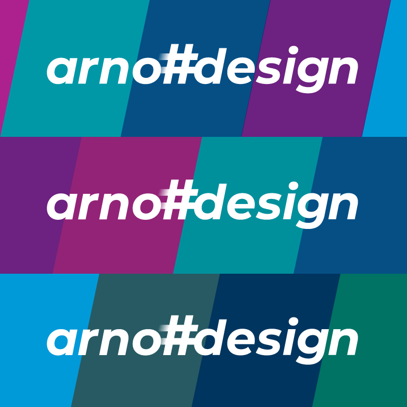
The Arnott brand rollout
As I’m sure you can imagine, there were lots of digital media applications, formats and source files required. In some ways it’s easier when we work with fellow designers because we know the lingo and understand the technical difficulties that certain aspects can bring with them. The rollout of Arnott Design was simple, our main job was to achieve visual consistency.
Why the Arnott Design brand works
The natural affinity that I spoke about above sums up the goal. Our job is to listen to what our customers want to achieve, view that goal through the lens of their customers – for the motivations will always be different. And then create a visual narrative that brings these elements together in such a way that feels entirely natural.
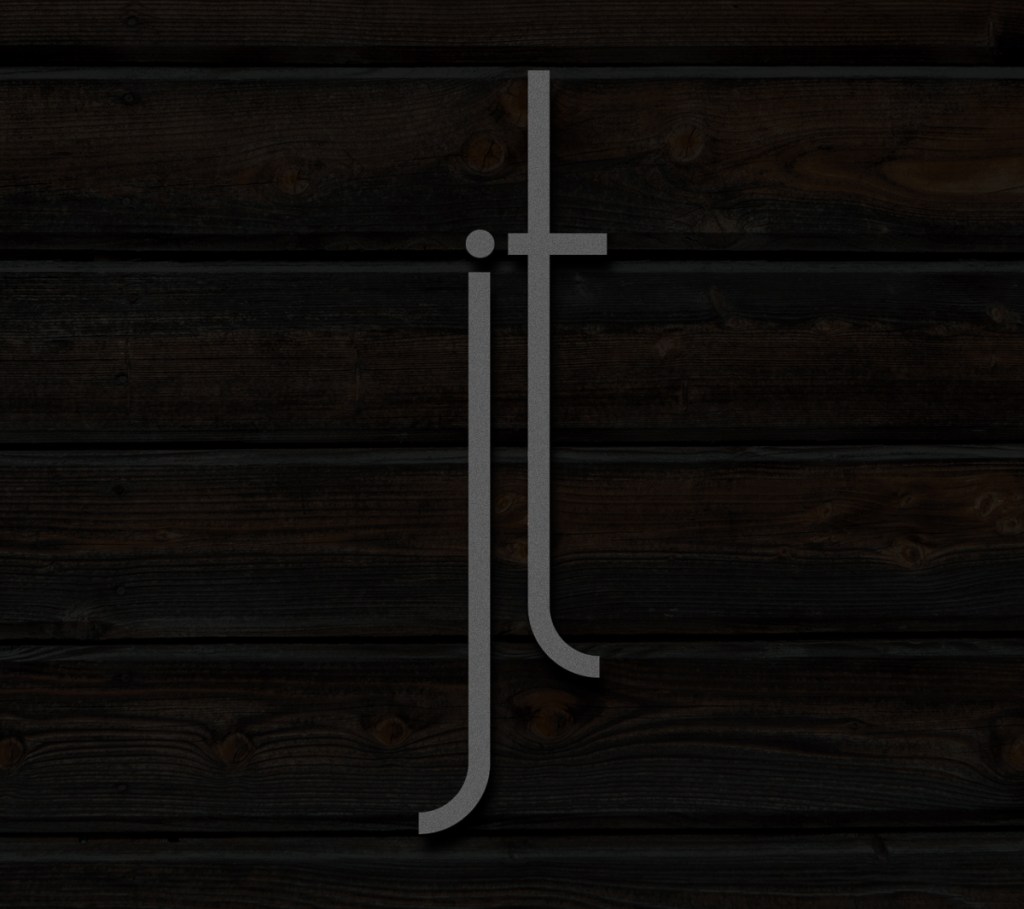
Jane Thomas
Who?
Jane Thomas is an interior designer. Her work covers many types of interior spaces, from houses to boats and everything in-between. Jane has worked around the world, creating unique spaces for her clients.
What?
An interior design business, the team consists of 6 people covering a multitude of interior design disciplines.
Where?
Based just outside Knutsford on the south Manchester/Cheshire border. Jane delivers projects around the world.
Jane Thomas – the brief
Looking back, I remember more about the pre-meeting briefing from another client who had recommended me. The things that I recall went something along these lines, “she’s had a lot of people look at the brand but they just don’t listen to what she’s asking for.” and “She won’t pull any punches, if she doesn’t like anything, you’ll know”. I’m not sure if it was the challenge or just a professional curiosity to meet Jane that drove me to setting up the initial meeting, nevertheless, we met and discovered a lot of shared passions. Whilst our work went in very different directions, our ethos and understanding of our role was very much aligned. We discussed personal and professional favourite styles, artists and the importance of originality. The conversation was flowing and I got a clear idea about what this business stood for in the eyes of it’s clients.
Now that might all sound great, I might even go so far as to say cozy, but Jane was very clear, “I like you, but I’m not anticipating that you’ll solve this brand puzzle.” It became clear that she had been burnt in previous engagements with brand designers (over promising and under delivering) and it would take some work (on my part) to overcome those experiences.
Jane Thomas creative ideas
I made a point of not letting the warnings get into my head. We had agreed a budget to explore ideas and concepts. Now it was my turn to understand more about the customers and the services Jane’s team provided – which were vast. It’s absolutely true to say that too much choice is no choice at all. Today we talk about the sense of overwhelm and this was a project packed with opportunities to fall into some very deep rabbit holes of overwhelm.
Taking time to step back from jumping into developing a visual solution to undertake in-depth research, I could understand more about the market drivers – wants and needs. It was exactly the right thing to do. In the process of my research I learnt much more about interior design – the applications and the clients. It’s one of those areas, there’s so much content to access – a wide range of printed lifestyle magazines, websites…places like Pinterest and other social platforms. All of these allowed me to get a better understanding of how the main players positioned themselves both visually and verbally.
Sticking with my instinct to keep things simple, I began the process of exploring the key letterforms associated with the brand name – J and T.
I have to admit that I am a lifelong fan of all things art deco. For me, the shapes and forms of that period have aged with great elegance. I’d go so far as to say that the sophistication has increased as they have aged. I believe that this is formed through the visual proportions of the movement. Many of the art deco forms were tall and thin, creating a sleek elegance, that for me anyway, remains timeless. I deliberately lent into this when developing this brand.
I explored a lot of typefaces but ultimately felt that what I wanted didn’t exist. Stretching fonts is never a good idea. All kinds of issues present themselves – counters no longer work, the balance of form and shape becomes all distorted and most important, they become much harder to read. So after lots of pen and paper sketches, development and refining, I digitally created my own.
Then came the next big challenge – colour! Given that colour and texture was a significant part of the services, how do I reflect that? What colour is right and which one is wrong? I mean that could, and would certainly change all the time. Again I looked back to the timeless pieces of Art Deco design. It was here that I saw the answer to my problem. A simple black and white identity would better serve. Saying less rather than trying to say everything.
Something simple and elegant in black and white could be applied to almost anything and maintain it’s style and composure. That was my gut feeling and my lived experience, but would Jane agree?
The rollout of the Jane Thomas brand
Sometimes you know within seconds that a meeting is going to go well, the outcome will be good and you’ll be leaving on a high. Other times it can be a lot harder to read the body language and fully appreciate all of the nuance of the situation. When I first presented the ideas to Jane we certainly started with little to no feedback. However, by the time I’d finished sharing my ideas we were both impassioned about where this was going. What it said and the simple elegancy with which it said it. We were aligned, I was so happy to have found the solution that Jane had been searching for.
The rollout of the brand went across a lot of physical things, not just digital channels. For example we developed and commissioned signage, vehicle livery and apparel on top of the regular stationery items and standard web presence.
Why the Jane Thomas brand works
Less is more. In this case, this business works with so many materials, textures and spaces that it called for restraint, and a hark back to some of the shapes of the past. Forms and proportions that have aged well. Emulating these within the design created a mark that could be applied anywhere. Taking a strong, proud approach with the positioning or strapline ‘Complete interiors’ said everything in just two words, leaving people in little doubt about the quality and skills available to them, through Jane Thomas, Complete Interiors.
Reflections on designing for designers
There you go, a handful of examples of the work that we have produced for fellow designers. Every project that we undertake brings with it new challenges and new learning. Personally, I love that, I love developing brands that connect with people, sharing knowledge and passions through the designs themselves and the narrative that we develop around them.
If you have any questions about the work here, or elsewhere within the Busy as AB site, please email me or arrange a call. I am passionate about the work, the value we bring and the people whom we help.
Creating a buzz looks different for everyone. We’re here to help you put your best foot forward, show your best self and create a buzz for your business.
