
Developing the Kellogg’s cereal bars concept remains a highlight of my professional design career. It was one of my first ‘big brand’ projects and an opportunity to learn a lot…about pretty much everything a business of this size does, how it operates and what works at that size and scale.
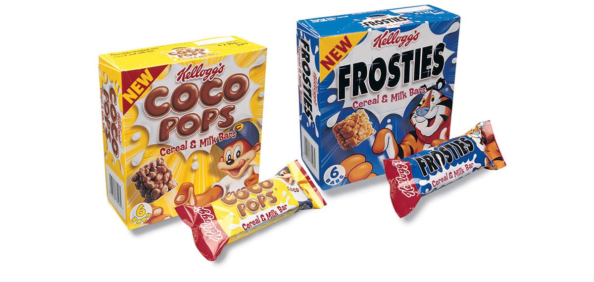
Having already developed new pack architecture for the main ‘box brands’ (Cornflakes etc) in an earlier project, this was an opportunity to take those values and concentrate them onto these new, little boxes and even smaller bars.
At the time the bars were the smallest packaging application of the Kellogg’s logo, there were lots of brand rules – do’s and don’ts that needed to be addressed but balancing the physical space on the bar, the importance of the characters, the brand name and colour palette, led me towards using the red band at one end of the pack with the vertical positioning of the logo – previously unheard of in Kellogg’s packs. Subsequently over time, as the products have became more recognised, the logo has returned to it’s natural horizontal position. But when these packs were very much a new concept, the presence of a bold, red panel holding the logo helped people identify this as a Kellogg’s product.
Working hand-in hand with the R&D team at Kellogg’s, developing new packaging methods and materials (cardboard engineering, plastics, wraps, print techniques and environmental materials) was both interesting and exciting.
For me, as a designer, the opportunity to established the Kellogg’s brand within a totally new sector (for them at the time) was a fantastic opportunity. I’m really proud to have been involved with project, this brand and the Bee team who helped me deliver it.
What did I learn?
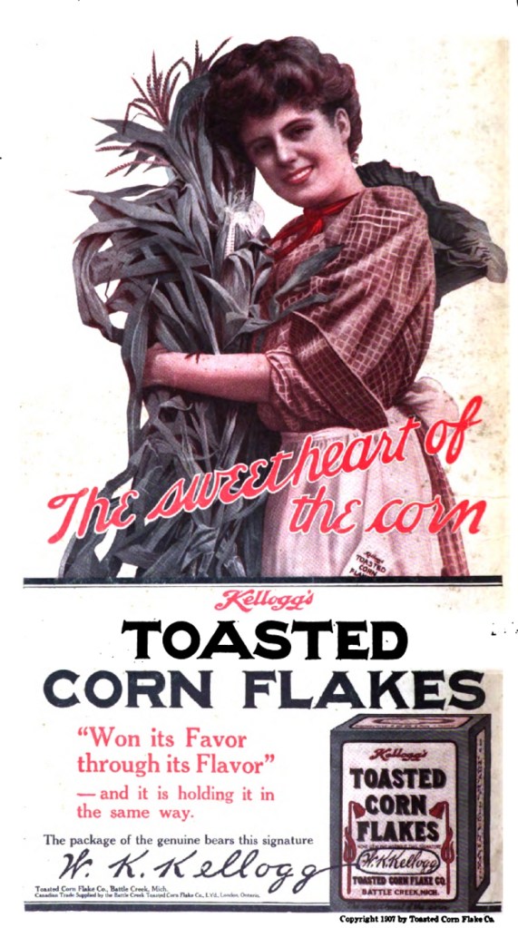
The simple answer…loads. Working with a global business, a food producer who manufacturers in 18 countries and sells products in over 180 countries there’s a lot to learn. First has to be the formidable heritage…Kellogg’s has been in business for over 100 years, that’s an incredible amount of time and that brings with it a wealth the brand heritage – only a handful of other businesses in the world have this kind of back story.
Some would say this level of heritage can be a handicap, how do you innovate a product that’s been around longer then most people can remember?
The Kellogg’s archive is vast, looking through the classic ad campaigns, packaging and other marketing materials made me realise the pressure that lay ahead working at this level. But that was massively out weighed by the thrill that I was able to play my part in this brands journey and the customers experience.
Taking all my learning and knowledge to develop a completely new line for the business was a real thrill…I might even go so far as to say an honour, but then that’s the designer geek in me, I was so excited to be working with the Kellogg’s teams.
It was a feast of inspiration and learning, looking back, seeing new products emerge and grow into the household names that we have today. Armed with the historical knowledge of the brands (and the rules that came with them), I found it genuinely exciting to work on the ‘new’ cereal bar concept.
Sure there were a lot of ‘golden rules’ and things that cannot, and should not be played with. But what an opportunity this was, to take all that’s gone before, use all those established values and develop them into a completely new range.
The power of internal communication
One of my greatest learning points whilst working on these projects has to be the insight I gained into the role of internal communications within a global organisation. Having the clarity of message, connecting that message with a passionate team of people who can lead the business, people who really understand their customers and show respect for the trust their customers have placed in them. This was always evident at Kellogg’s and I believe it is a powerful part of what has brought the brand such success.
People at all levels of the business clearly understood ‘why’ doing their role was important and how it came together, like a giant jigsaw, to provide a great product for other people. Over the 20-odd years that I have worked with businesses – some big, some small – all of the successful ones were clear about their role in the world, they respected their customers and strived to inform everyone within the business about what they were doing…and why they were doing it.
The Kelloggs projects were fantastic to work on. They refined and cemented packaging principles that continue to serve us to this day. Our work always centres upon the same statement, “Is it human?”
All our work seeks to create rich, human connections between people and products or services. If you’d like to know more about what we do, contact us.
