The current Lord and Lady Cavendish have established Holker Hall as a regional tourist destination, a place where people can explore acres of manicured gardens and discover the unique environment of this coast line. But Holker is much more than a pretty hall and gardens, it has been the home of the Cavendish family for over a century and is a prominent local employer with a diverse range of businesses that use the resources of the estate to produce unique products.
The existing Holker brand was incredibly intricate and detailed… a very traditional coat of arms that had evolved into what was considered to be the brand for all the businesses that sat within the Holker group.
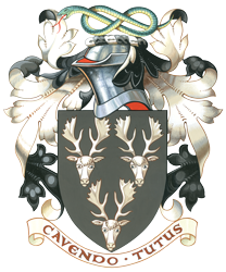
The desire to grow and diversify the Holker businesses required a stronger identity – something simpler, friendlier and with all the hallmarks of an established country estate. The colour palette was incredibly important to the Cavendish family, they wanted to maintain key elements of their coat of arms within the new brand identity.
What did I learn?
History is such an important part of every brand. It’s a incredible asset, there really is no substitute for time, embracing some of that in the development of new directions…new brands, is crucial for both your existing customers, who know and love you, and also for your new customers who will want to know ‘Why?’
Evolution not revolution
I remember presenting the initial concept work, it had two very different takes on the brand. One was very much a development of the existing identity, taking it forward and modernising and standardising it, the other was a completely fresh approach, maintaining the name but bringing a whole new set of values and colours to the brand.
The client was very receptive to both, but I felt that the evolutionary route was the way to go, there was so much value and recognition in the existing brand that bringing something completely new into the businesses would have required significantly more time and budget.
Developing the brand
Holker Hall is a multifaceted business, whilst the immediate need was for an update of the brand to help launch the Holker food hall, the brand would extend into property development, a slate quarry, race course and flower show. All of these elements needed their own sense of identity, whilst clearly remaining part of the bigger group. Colour palettes were key, each part of business needed to feel different, reflecting its products and customers.

Writing a new chapter
I feel honoured to have played a part in the history of this long established estate. This identity retains many of the families personal affiliations and connections for the original crest. This is such an important part of the process for me, if you’re not 100% comfortable with your brand identity, positioning, colours…whatever it is, those doubts, however small, will creep out and infect everything that you’re doing.
It might not be immediately obvious, but they surface over time and niggle in the back of your mind. I spend a lot of time, face-to-face with my clients explaining the thinking behind the work, why and how we’ve designed the shape…the colour…the font and more.
It’s incredibly important to me that all our clients feel comfortable with the end solution. This ‘comfort’ doesn’t always come naturally, sometimes it takes time – reflecting and exploring just how this can work. Everybody is different, and every business different as well and that’s part of the challenge and the reward, making personal connections, creating a buzz for your business.
Holker Hall is a good example of brand consistency. The visual narrative we created was successfully carried across a wide variety of sub brands and sectors.
Our work always centres upon the same statement, “Is it human?”
All our work seeks to create rich, human connections between people and products or services. If you’d like to know more about what we do, contact us.
