Every now and then there is a project that comes along where I have to pinch myself, this was one such project. Working with AEL to develop their brand and deliver a Status Quo event was a great opportunity to deliver a multi-channel brand experience.
Promoting the promoter
AEL – Astonbury Entertainment Limited is a music event promoter, and like many music event promoters they already had an identity of sorts. It depends of your definition of what that means, but in the loosest sense of the word – the name had been fashioned into a word mark.
AEL operates with some big artists and other collaborates with other event promoters on some huge events, creating the right impression with those businesses is a critical part of the health of the business.
AEL has to look established, trustworthy and above all professionally competent. The management team saw the value in taking that image to the next level. They have ambitions for further growth and want to build a reputation that would allow them to expand the current artist and event offering. Updating their outward profile to reflect the level at which they already operate was the next logical move.
Like any sector of business there’s competition and putting your best foot forward is critical. Whether we like it or not, we as humans are pre-conditioned to use our visual sense above everything else, in fact we are so used to using this sense to measure so many aspects of life that we’re not always conscious that we’ve done it.
Getting the right image out into the world is really important for every business, most people will make a multi-level decision about what you do – your competency, professionalism, authenticity and a host of other personal values within seconds (2 to 3) of their first interaction or touch point with the brand.
Here… there… everywhere
AEL wanted an icon that could be applied across a whole host of events from rap artists and break through pop to classical music and the lofty heights of opera. The identity had to transcend many genres and go across many, many channels.
In order to do this, I knew that the solution had to be simple. Simplicity is really important within any brand solution, great brands work by being clear and understandable, that comes from simple, clear messages, whether they are visual, text or a combination of both, less is always more.
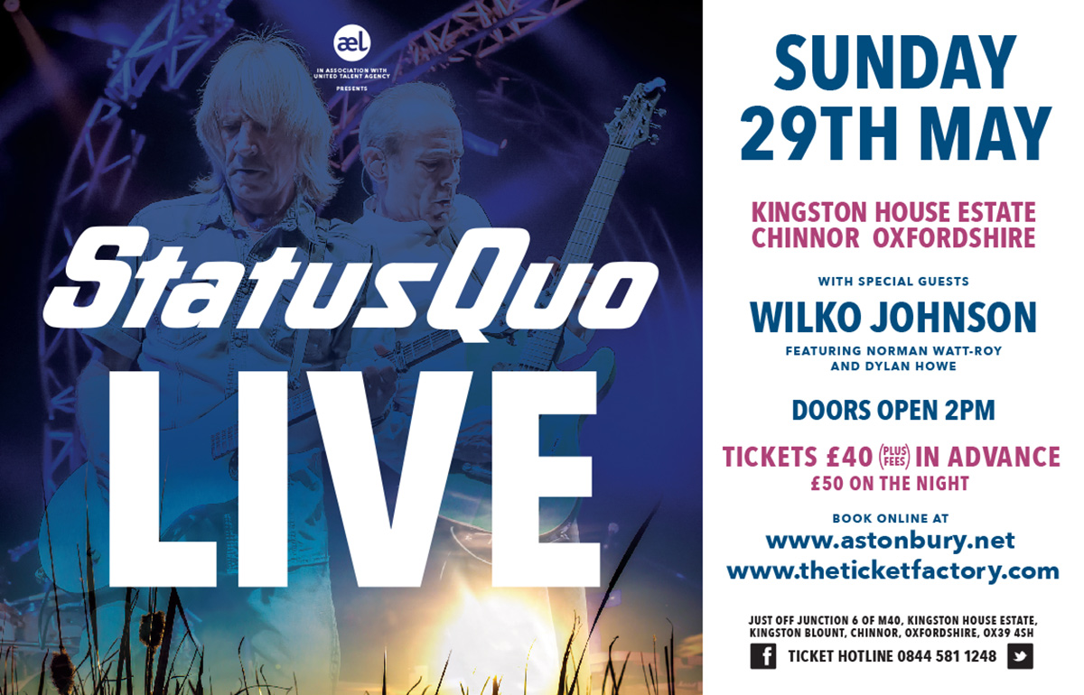
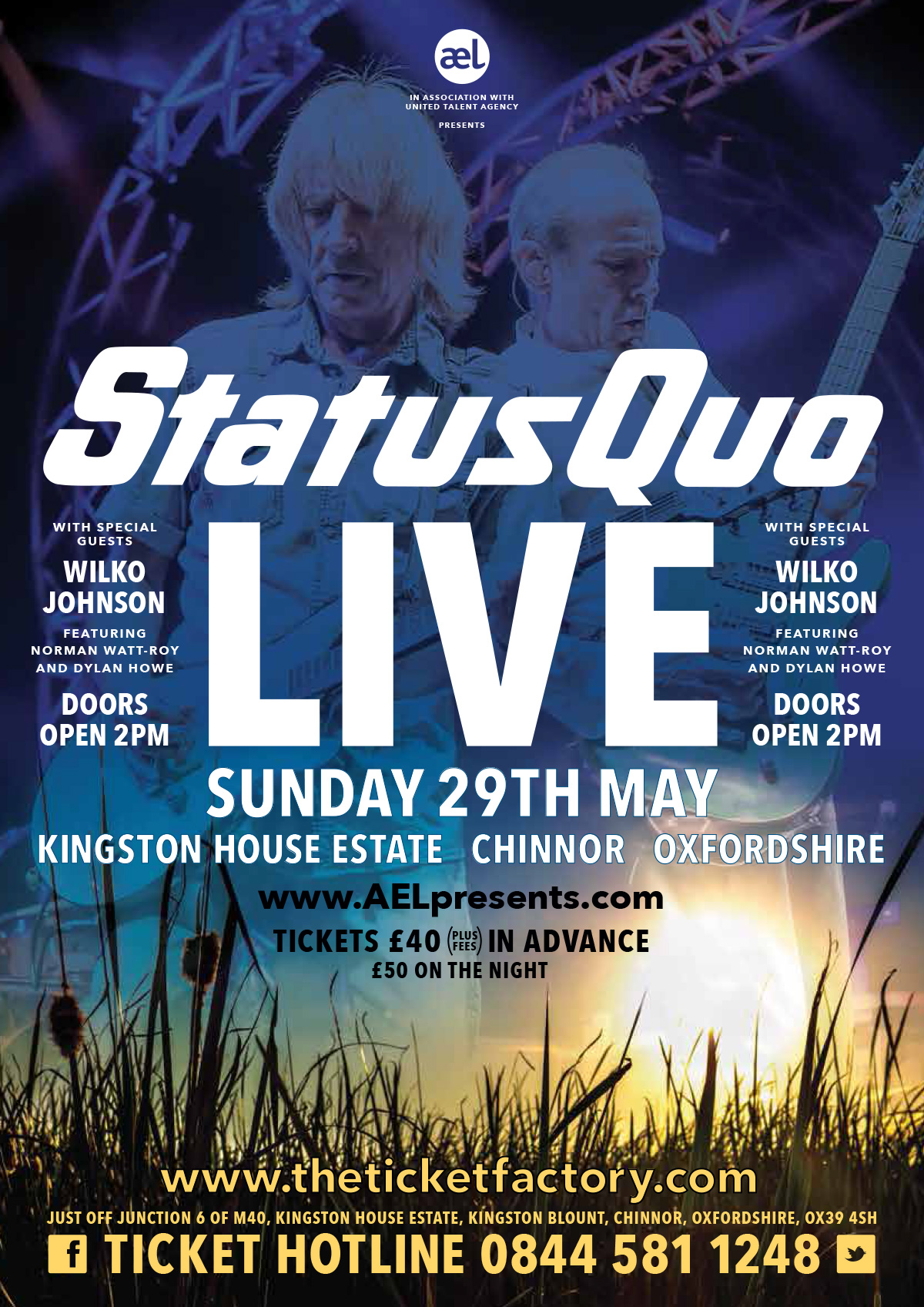
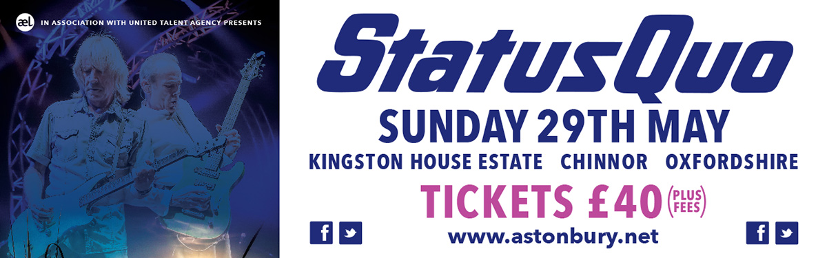
Within the main event literature the AEL brand plays the role of the support act, present and sharing many of the values of the headliners, but it’s not in the spotlight, that is until you come to the actual event. Come the day of the gig, the venue and everyone and everything associated with it carries the branding.
The logo is quite literally everywhere – from signage and literature to clothing, vehicles and all manner of promo items. Again simplicity is really important here, this mark has to work hard, sometimes it’s used as a very small supporting piece, other times it’s a flag, quite literally, identifying where people go and what to do.
Maintaining the Status Quo
Love ‘em or hate ‘em everyone knows at least one Quo track, and if we’re being really honest we’ve all rocked out to one of their tunes at some point…admittedly it might have been after one too many shandy’s at the youth club, but we’ve all been there.
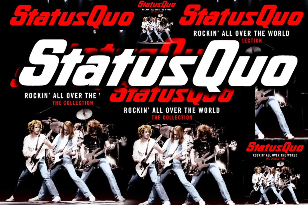
Status Quo isn’t just a rock band, it’s a brand and like any global business, there are rules to follow – do’s and don’t’s, colours, images and a brand guide that you have to follow. This project was no different, the Status Quo identity has been around for a long time, it’s immediately identifiable whether you’re a fan or not, and that’s another really important part of successful branding – consistency. Maintaining the way in which the brand identity is used, the colours and associated imagery play a really important part in the overall experience people have with what you do.
Some people might argue that with big name bands, like brands, you don’t need to work as hard to get a message out. I’d disagree with that, whether you’re a big name or an up and coming wanna be, delivering a professional, timely and consistent message is absolutely key. I believe it’s more important as there’s more expectation from the audience of an established group, you have a relationship with the fans, that’s a very special thing that has to be nurtured and respected. Bands and brands are only successful when they understand and connect with their customers.
I was really pleased with the way in which the work was received by the both AEL and the management team at Status Quo. Sure there was some tweaking along the way, some very minor tweaks and that reflects the part played by the brand guidelines and a clear brief. Once approved there is a myriad of applications that are required from press to posters and all manner of social and web assets.
What did I learn on this project?
As always there were lots of things to learn, not least about Status Quo. Looking at their back catalogue it was clear that the (now iconic) word mark had always been central to everything the band had produced. The brand guidelines were very clear about what could and couldn’t be done here.
One of the elements that is often overlooked within brand development is the research that is put in to understanding where the brand has come from, what’s been done before and how popular it was…or wasn’t – a less than desirable outcome can bring great learning and that refines your processes and ensures that you don’t repeat the process again.
We always spend a significant amount of time researching the business we are working with to ensure that we have a deep understanding of what they do, why it appeals to certain people and what types of relationship people want to have with that business. More importantly we always research the clients competitors. No business is unique, branding is the mechanism by which we all humanise a process, service or product. Every business needs ‘life’ injecting into it if it is to survive, and the business needs to know where it fits in peoples lives, what’s appropriate and what’s not.
To get this level of understanding takes time, the solutions provided are most definitely influenced by quality, in-depth research. I always take great pride in the way in which our work is received when we present projects to clients because there’s a real synergy in the room that is often commented on. We make the time to understand the business and that understanding enhances the output both visually (including tone of voice and copy) but also with strategy.
When we have the knowledge and understanding of how a business operates and who it’s ‘people’ really are we can create a buzz for that business.
This Status Quo campaign is just one example of the work we produce. Behind the visuals and messaging sits an array of development stages – research, analysis, focus groups, tests and revisions.
Our work always centres upon the same statement, “Is it human?”
All our work seeks to create rich, human connections between people and products or services. If you’d like to know more about what we do, contact us.
