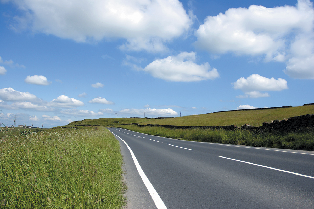
The Red Routes initiative was first trialed in Lancashire, where the local constabulary created a series of warning signs on dangerous roads throughout the county.
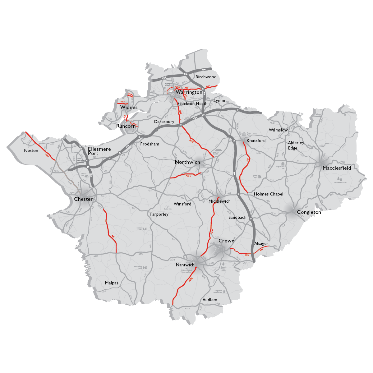
Cheshire constabulary had watched their neighbours activities, seeing that the signage had had a dramatic positive affect on user behaviour. Cheshire wanted to take things to the next level and develop a Red Routes brand, something to identify dangerous roads quickly and easily for all users.
This was where we were called in. Following a highly successful campaign that we had developed for speed awareness during the World Cup, we were asked to look at the Cheshire Red Routes project.
Striking the balance
This brand needed to be authoritative, but in a friendly and informative manner. Cheshire Constabulary had conducted extensive research on the mood/influence of warning signs on road traffic users. This data proved that ‘pointed finger’, accusatory statements and graphics were a real turn off – no real surprise there, that’s human nature, if your message is outwardly aggressive or accusatory it will not connect with people, and certainly not connect in a good way.
The new brand and the associated signage needed to be engaging to as many road users as possible. The fact that it would sit along side the constabulary shield and ‘think’ icon would reaffirm the sense of authority. There was a fine balance to be struck, we needed to be purposeful and thought provoking but not inflammatory.
Joined forces
A sense of community and collaboration was required, so people on both sides of the coin understood and connected with this brand, after all it was there to help everyone and hopefully save lives.
The solution had to be incredibly simple. Road signage information needs to be clear and immediately understandable. We often talk about the first impressions of a brand being 2-3 seconds (max), in this case it was more likely to be between 1 and 2 seconds from a vehicle moving at speed. The simplicity of the message was key, people had to connect, process and understand it in a split second, and that understanding needed to be positive – read the full case study here.
The solution
Red is a very aggressive colour. There are good reasons that it’s used as a warning or a hazard. It’s also a powerful colour, commanding attention and standing out in the environment. There are many brands that use red extremely effectively as a part of their brand communications…there’s a certain soft drink that springs to mind.
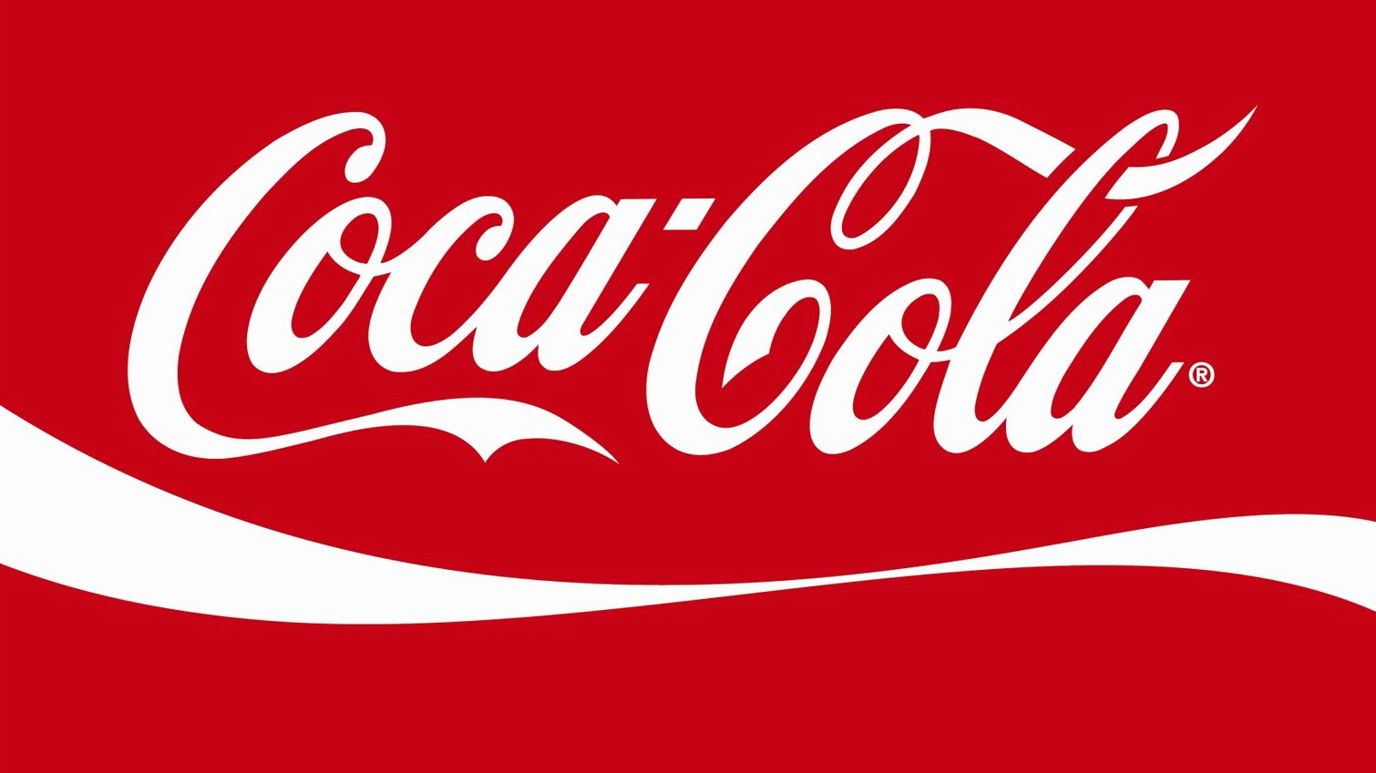
Coca-cola pretty much own red in the retail space around the world, so I was interested to look at how they balanced the power of the colour with the soft, flowing character of the brand mark.
It’s got curves
Curves, lovely smooth flowing curves have been at the heart of the Coca-Cola brand for over half a century, only recently have they been put on hold in favour of a circle, which lets face it, is one big old curve that simply never ends (very clever).
I wanted to get curves into this design, curves clearly worked for Coke, no matter how much you do or don’t identify with it today, there’s no denying that Coke is one of those brands that feels like it’s always been there, an integral part of life, some of that good will and positivity would be most welcome in Red Routes.
The other thing about curves and road signs is that they are not usually found together. Road signage in the UK uses straight lines, circles and prescriptive angles to communicate directions (and I have to say that I think it’s a brilliant piece of design, that has really stood the test of time). But I needed something that would stand out, be different, and engage people. The brand needed to highlight the potential dangers whilst remaining friendly with more of a parental advisory overtone.
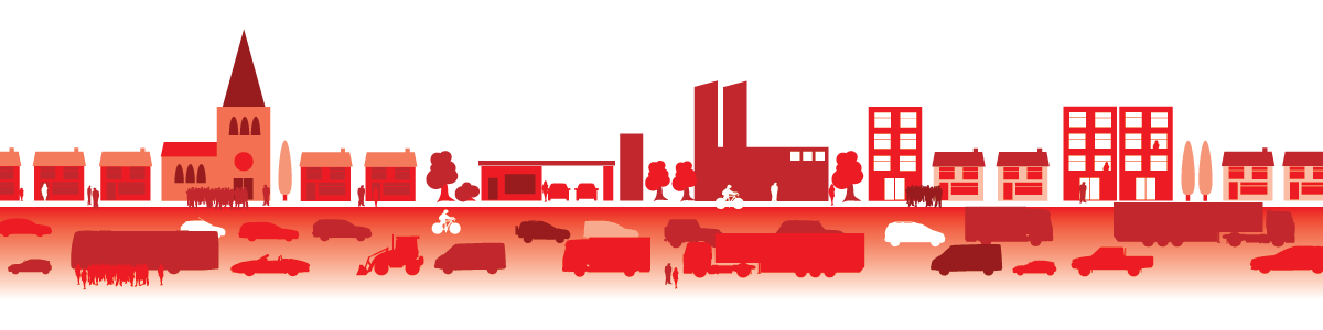
The solution blends curves, not as curvaceous as Coke (nor anywhere near as timeless I’m sure), but much more informal than the traditional straight lines of road signage. The road shape is accompanied by a series of simple shapes and forms of people and buildings. This naïve style was a deliberate decision, the places where the signage would appear varied greatly, from rural country A-roads to busy urban commuter belts, the shapes needed to be identifiable but not prescriptive, allowing people to recognise elements of their own community and place within the graphic.
What did I learn during this project?
As always, there were lots of interesting things to learn. The information, research and data that the constabulary carries out is nothing short of amazing. Unfortunately much of it is the result of extreme harm or death to people on the roads up and down the country. This is truly shocking, during this project it was important to maintain perspective and see the opportunity that was presented…to make a meaningful impact and help a lot of people.
Branding is often accused of being the devil’s work, convincing people to buy things that they do not need. But it doesn’t have to be that way. Think about charities, the environment, health and well being, they are equally complex and often communicated through a simple graphic. Producing the Red Routes brand was an opportunity to help people. It has brought together communities and helped heal wounds.
Whether we like to acknowledge it or not, roads and road traffic can be a dangerous place, having brands like Red Routes helps everyone identify where and when we are at risk, and I feel that has got to be a good thing, I’m proud of the work we produced to help the Cheshire constabulary connect with drivers and communities in a positive way.
The Red Routes projects are an example of the community-focused work we produce. This involves research, analysis, thinking and development that sits behind what you will see shared in the community.
Our work always centres upon the same statement, “Is it human?”
All our work seeks to create rich, human connections between people and products or services. If you’d like to know more about what we do, contact us.
