Dream jobs, we all have them and I’ve been lucky enough to realise several of my career goals over the years. These opportunities often present themselves at the most unusual of times. I can remember pinching myself, when in one of my first roles at an agency, I saw my work on the shelves of a national supermarket – wine and other foods that I’d designed the packaging for, being bought by customers, it really was exciting, and still is today.

One of the best bits about my role has to be the concept presentations, something I used to dread doing but embraced and now love with a passion. It is one of the most exciting parts of our projects – the moment when we reveal the thinking and direction for a brand or business. It’s also a crucial moment in the development and delivery of every brand project, the make or break moment. It literally is cards on the table as we reveal our thinking, our research and express our creativity. Demonstrating what the brand currently says, how we can improve those messages or even redefine them and the way in which they connect with people, who they aspire to be and much more. Like I said, it’s a really exciting moment.
The BIG job.
When we are asked to work with any client, there’s always a sense of pride. There’s no greater reward than a business engaging with you because they recognize the value you can bring to them. The Northstowe Pathfinder project brought that feeling, along with an extra hit, a real sense of occasion and anticipation, we were now working with The Church – the oldest and undoubtedly the most recognized institution on earth.
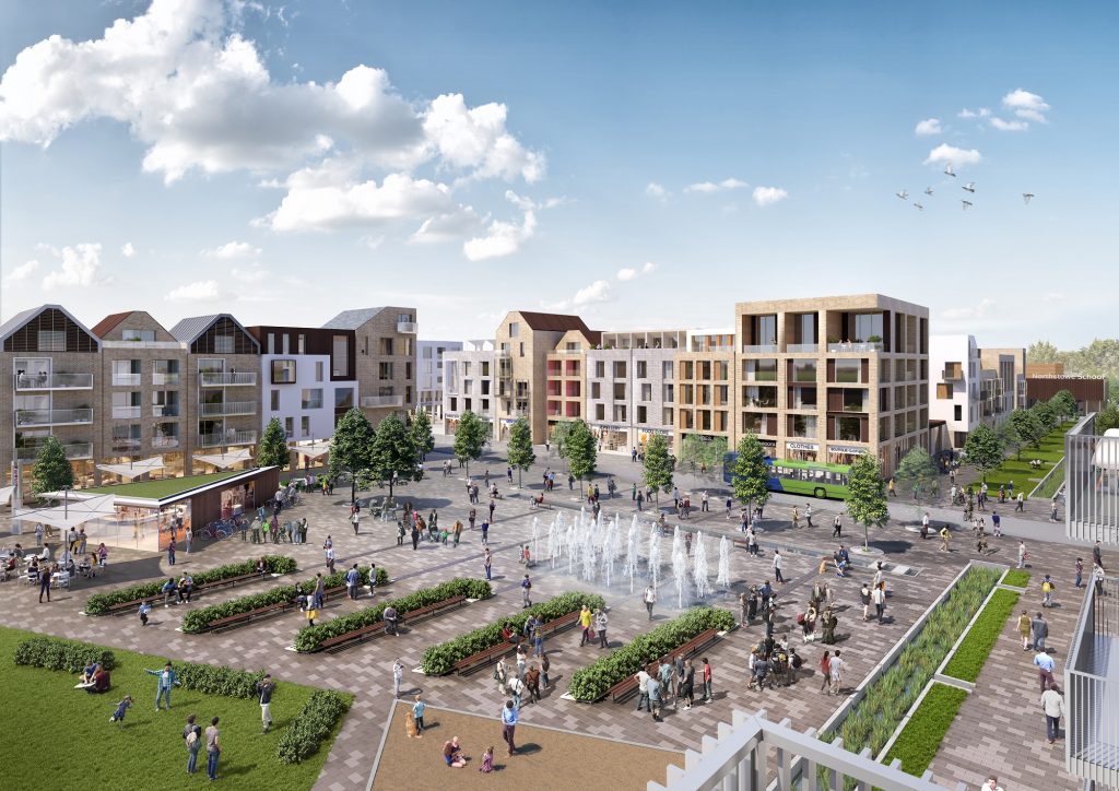
Northstowe is a new town, not far from Cambridge and like many new places, the residents wanted to create a sense of place, a community and share the opportunity to socialise.
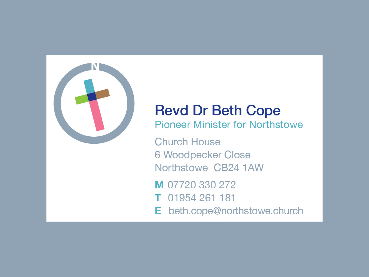
Pathfinder Church, under the careful direction of Reverend Dr Beth Cope, really wanted to help create community in Northstowe. Beth leads a dynamic group, boxing way above their weight, trying new things, experimenting and listening to what people want from the church in the 21st century.

What was required…
Create a modern, open interpretation of what church and religion means. Something that would be inclusive, feel warm and nurturing with a fresh dynamic that also energised those involved – those delivering and those attending.
Whatever you believe or don’t believe, there’s no denying the enormity of expressing God and Religion in an appropriate way. There have been, and continues to be some amazing expressions of religion in art, architecture, design, fashion…pretty much every creative channel has tackled the ‘big man’ in various ways, with many themes and approaches. We had a lot to live up to.
Where to start?
For us this identity was all about the place, Northstowe. Whatever we did, however this played out, it needed to be intrinsically connected to the location.
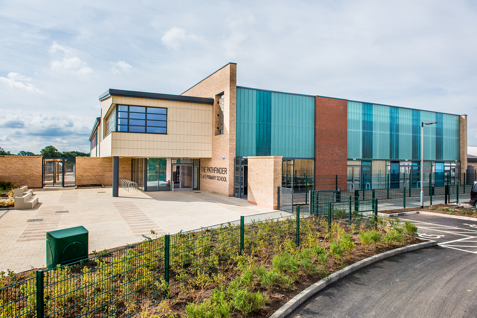
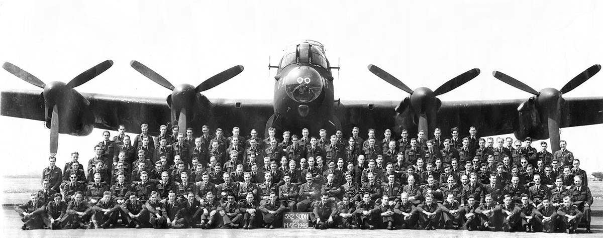
Northstowe is a place with historical significance. During the Second World War the Pathfinder Squadron flew from an airbase built on the site of the current housing development. These connections are commemorated in the names of streets, and the school: The Pathfinder Church of England Primary School.
For the church school and the young church that is growing there, the name “Pathfinder” also celebrates the idea of following in the footsteps of Jesus who is often referred to as the “The Pathfinder”.
![]()
The school building is also the first community space to be built in Northstowe, proudly displaying an unusual twisting cross that hints to the twists and turns of pathfinder life and reflecting the longer history of the area. The cross is based on Jonathan Clarke’s 11-meter “Way of Life” sculpture, which greets visitors to Ely Cathedral.
For the local church growing in Northstowe, this symbol connects them back to the 12th Century and the ‘way of life’ of St Etheldreda, founder of a religious community in what is now Ely Cathedral. St Etheldreda was a real innovator, revolutionary, and unusually at the time, a woman. She significantly shaped and influenced the activities of the churches in this area, her foresight and innovation then expanded throughout the UK and further afield. (She is commemorated in numerous places – read some of her story here. Then as now, the Northstowe geographical area was part of the Ely diocese: these links needed to be celebrated within the Pathfinder Church identity.
Like any new town, the development has been branded and we needed to acknowledge that too. As a town, it’s still in the early stages, very much in its infancy, however, everyone that lives there has bought into the Northstowe brand. What the developers have envisaged, the promises they’ve made, the design and the identity of the place. Launch publicity and the on-going communications for Northstowe have used bright colours with a strong diagonal graphic. Pathfinder Church required a solution that went beyond the here and now, something that would connect the past, present and future.
‘Less is more’
…has always been a big part of my design mantra. Keep things simple and clean so people can understand, therefore connect more easily with what you’re doing. In a new place, where there is still a lot of construction happening, people are living busy lives and distraction (in all forms, but particularly digital) has never been higher, so we needed a simple solution.
![]()
What did we do?
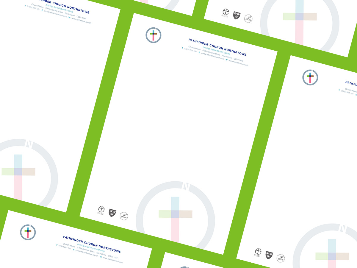
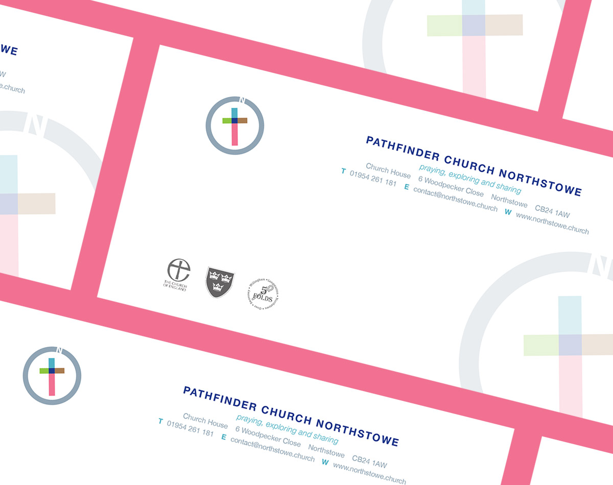
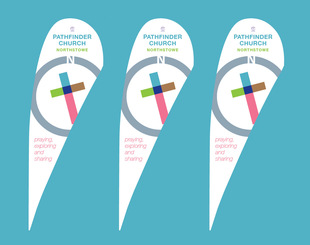
This is the solution, a simple geometric shape that has subtle connections to the new Northstowe, the old air base and expresses the community of the church in a positive way. There’s a prominent cross – set at an angle in a nod to the twists and turns of St Etheldreda’s ‘way of life’ – and much more, see Beth’s feedback at the end of this post.
In many ways this was no different from a new business brand reveal and development, in others it was way more emotional and I felt duty bound to deliver a really versatile solution that would grow with the place and the people.
Pathfinder Church has been growing for nearly a year now and we felt it was time to go back and ask Beth a little more about her experience working with us, the solution and living the brand day to day…
“Starting church from the ground up in a new town was always going to be an adventure. We wanted to bring together both the richness of the ancient traditions of our faith and contemporary relevance within the twist and turns of everyday life.
Many churches have architecturally striking buildings of great historic interest. Here in Northstowe, we simply had a small group of people getting together, “praying, exploring and sharing” – working out what it means to be church in and for this place. We started to wonder if, for this graphic-rich, digital-savvy generation, working with a graphic designer might be the equivalent of our forebears commissioning a master stone mason.
And so we turned to Andy to help us develop a visual identity that would be recognisably “church” to those who are looking for that. We also wanted something that would also speak to those of all faiths, and none, of our desire to spend time with them, building relationships and playing an active role in the community-building and place-making.
Working with Andy was an enjoyable experience. He quickly grasped the things that mattered to us; spent some time researching and imagining; brought expertise and new questions for us to consider, coming back with three possible directions that we could go in.
![]()
We were able to bounce ideas around, explore possibilities and work together to arrive at a solution that really works in a number of contexts. For example, we need to be able to put up joyful banners and social media posts but also use the same branding when writing to bereaved families to plan a funeral. The bright colours and strong diagonal – which connect so well with Northstowe’s branding – work beautifully in the first setting. And the somber black and white version is important in the latter.
We’re really aware that we’re just getting going, and there is so much more that we could do with the branding: but we’re taking it steady and will only do more as our indigenous team grows. Our main focus in on growing a community, after all, not a media campaign: but having the right tools certainly helps.
![]()
One of the things I’ve most enjoyed about seeing the branding ‘at work’ is how the many layers of almost ‘hidden meaning’ speak to different people. I love how it has taken on a life of its own! The logo resembles a compass – the perfect tool for ‘pathfinders’ on an adventure. The offset ‘arrow-cross’ celebrates that we’re not there yet: we welcome those with questions, and we’ll walk with them on the journey. To some, the N at the compass’s peak reminds them that this place, “Northstowe”, is of key importance: it’s where we feel called to live out our faith and make a difference by getting stuck into building community. That shared priority really helps us work with those around us – regardless of what we each believe. Others have suggested that, to them, it speaks of God as the ‘true north’, and Jesus as The Pathfinder who accompanies us on the adventure and inspires all that we do: something that as Church is of course crucially important. Yet others have noted how the simple circular outline, with the open white space in the N, shows an open invitation into our community. We’ve been trying to live by such principles, so to hear that they are recognized in our logo too is really encouraging.
Looking ahead, we have plans to strengthen our online presence – and will certainly be using the style guides and branding principles that have been set up. But it has been invaluable to have been able to start out with something simple that ‘just works’, and looks set to grow with us as we and the town mature”.
The Pathfinder Church, Northstow is just one example of the work we produce, the research, thinking and development that sits behind what you might see as a customer.
Our work always centres upon the same statement, “Is it human?”
All our work seeks to create rich, human connections between people and products or services. If you’d like to know more about what we do, contact us.
