Repeat pattern designs have been a major part of fashion branding for over 100 years. There are some truly beautiful designs that have transcended generations, remaining almost timeless in their appeal and popularity. Don’t get me wrong, of course there has been the odd tweak made along the way, new colour ways have been developed and other minor aesthetic updates have nudged things along just enough to stay true to the original, whilst adding a new dynamic.
The biggest players in ‘house patterns’
Lets look at the people who started developing these featuring and explore the designs and the reasons behind them. There’s a really strong formula at work in this space, I think it’s worth explaining what I mean.
These repeat pattern designs prominently feature the brand name and/or icon which is used within a repeated design and colourway to create what is referred to as the ‘house pattern’.
These design elements play a significant role in the communication of almost every major fashion brand. These patterns have, in many instances, become iconic, instantly recognisable through the application of these designs across all manner of objects, often defining and redefining what is luxury and elegance.
In this blog post, I’ll be discussing some of the world’s most famous repeat pattern designs and the designers who developed them, including Chanel, Louis Vuitton, Gucci, Fendi, Dior, Burberry and more. Here goes…
Let’s be honest, there was only ever really one place to start. Chanel! It’s one of the oldest and most established, it’s also the one that comes front of mind for most people when they think fashion and luxury.
Chanel
There really is only one word that I need to use here – Iconic. This is the pinnacle of less is more, a pattern that works wonderfully in black and white and never fails to look classy.
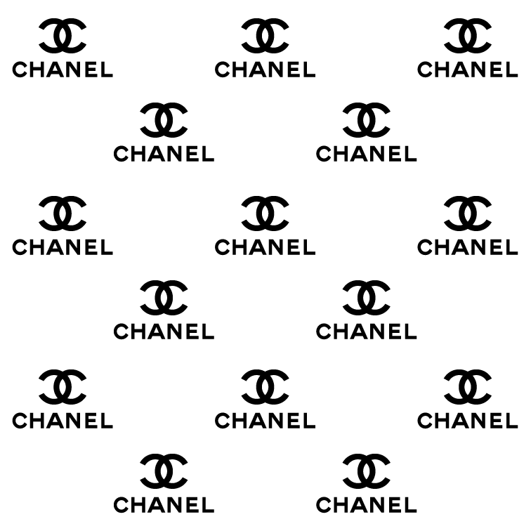
The Chanel monogram design and technical details
The two interlocking “C”s logo was first created by Gabrielle “Coco” Chanel in the early 1920’s and has remained a signature of the brand ever since. The logo was inspired by the stained-glass windows of the Château de Crémat in Nice, France, where Chanel stayed while visiting her friend, the Duke of Westminster.
Everything about this design screams minimalism. Coco could have chosen any “C” letterform but no she uses the simplest one she could find. There’s a real beauty in design that doesn’t need “decoration”. It’s super simple, nothing more and nothing less than what was absolutely necessary. The way the two “C”s are opposed brings both symmetry and a dynamic to the design that is very pleasing to the eye.
The Chanel logo applications
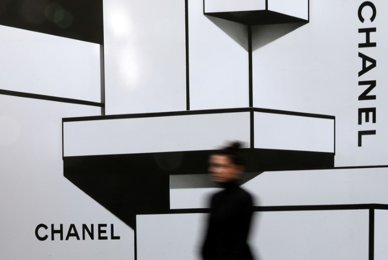
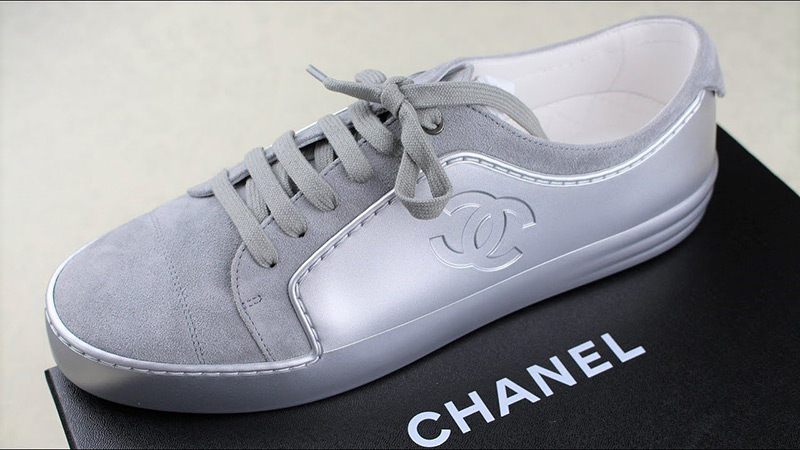
The icon is used on everything that Chanel produce, particularly clothing and jewellery. More recently the repeat pattern has been used in large graphical installations for shows, new lines and within retail spaces.

The Chanel repeat pattern design is considered by many, to be the symbol of timeless elegance and luxury, it is synonymous with the brand around the world and instantly recognised.
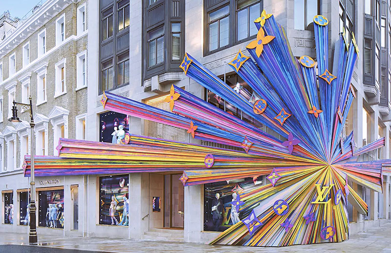
Louis Vuitton
Here’s another design that has transcended generations. It’s not as simple, nor as classy in my opinion, as the Chanel mark. But there is no denying the impact this monogram has had for the brand.

The Louis Vuitton monogram design and technical details
The company’s founder, Louis Vuitton, wanted to create a design that would be difficult to copy, the LV monogram that we all know today was the result.
Originally designed in the 1890’s, to prevent counterfeiting, Vuitton wanted to create a design that would be difficult to copy. Today, this monogram is synonymous with the brand, it remains the benchmark of authentication for all Louis Vuitton products. If you take a close look at the knock-off copies, the pattern is never 100% correct.

The repeat pattern design features an italicised, serif, uppercase “L” with a roman, uppercase “V” letter. The exact font used is hard to determine, but it is probably based on a classical typeface like Garamond or Caslon. These two letterforms are arranged in a pattern that uses a lot of space, allowing each element to breath, there’s no overcrowding or clutter.
The other icons within the pattern are all stylised, simple floral forms that when arranged with the LV mark have become instantly recognisable as the Louis Vuitton luxury fashion brand.

For me there are two elements here that work together exceptionally well. First we have the intertwined letters, italicising the L is the ‘stroke of genius’, without this the two shapes would be forever at odds, fighting one another – one vertical the other very much at 50-60 degrees. Essentially, the design takes two letterforms that shouldn’t balance and work together and blends them into something that is infinitely applicable to almost anything.
The second part of this design that I admire, is the way these letterforms are used within the repeat of the pattern, the ‘floral’ icons that sit in between using both positive and negative space to create a surface pattern that has real strength and cohesion. Unlike many of the other patterns the LV repeat doesn’t rely on close spacing to work.
The Louis Vuitton logo applications
The monogram was first used on the company’s trunks (travel cases not swimmers), which were known for their durability and quality, these were the forerunners that created the brand we now know. Today, the Louis Vuitton logo is used on everything, the range of applications is enormous, entire facades have been covered in the repeat pattern and of course the clothes, shoes, jewellery and bags wear the pattern with pride.
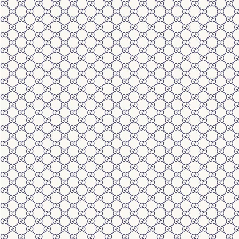
Gucci
The Gucci double “G” logo is another iconic repeat pattern design from the world of fashion. The typefaces used within this design have evolved over time, with some of the earlier designs becoming the most coveted in the world. Let’s explore this design a little further…
The Gucci monogram design and technical details
Following the same formula as many of the other fashion brands repeat pattern designs, Gucci’s house pattern features two interlocking, uppercase “G”s of Guccio Gucci, the founder. This repeat pattern design was first introduced in the 1960’s, the logo itself was designed by Aldo Gucci, who was the son of the founder.
The letterforms have been used in various positions or facings over the years, starting out facing one another, where the overlapping design creates an outside shape that has an organic, smooth feel. But that’s only part of the visual impact, the negative shapes (the space inside these forms) within the overlap bring elements of tension and an ‘edge’ to the design. I personally prefer the version where both of the “G”s are looking east (this design was used throughout the 80s and 90s).
If I didn’t know better I would say Gucci had watched the Chanel business and the success of their repeat pattern because there are some alarming similarities within the visual look and feel. Where this really comes into it’s own is the layout of the monogram, the way each doube “G” is joined.
As a designer faced with a double “G” brand name and looking to create something aesthetically pleasing, I would certainly have explored this route as well because it makes for a visually simple and pleasing shape, which plays into my personal love of ‘less is more’ design, but it could be argued that there are a striking number of similarities to the Chanel concept and perhaps that was intentional?
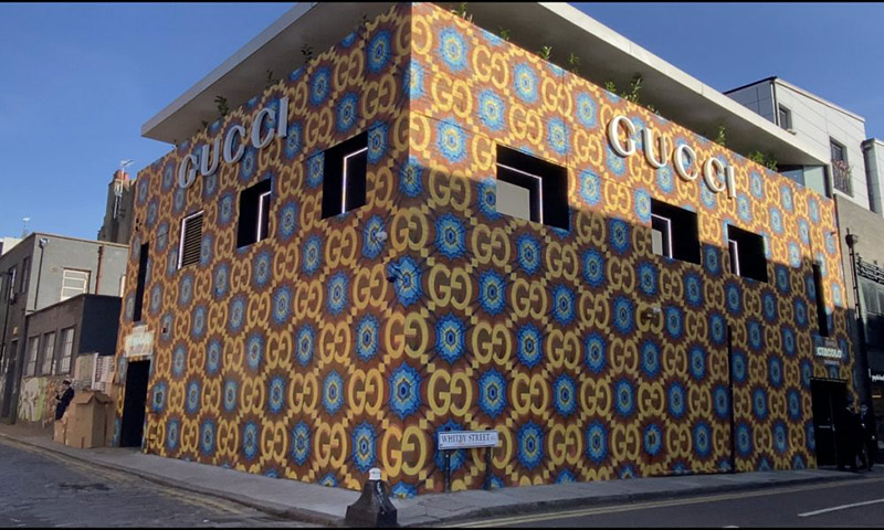
The Gucci GG logo applications
Like all of the other brands, this design has been used on everything – which given the timeline of when it was developed and introduced, feels like they wanted some of the Chanel business and brand awareness to me.
Fendi
Ok we’re only at the 4th example (BTW there are 100’s, but I’m not going to try covering them all) and there is a clear theme in play across every brand/business.
All of these iconic fashion houses are using repeat pattern designs based around either their name or founders initials. Taking the letterforms and stacking, mirroring and overlapping them to create a symbol that works when repeated across almost any surface. These repeat pattern designs embody the values of the brand and have become instantly recognisable around the world.
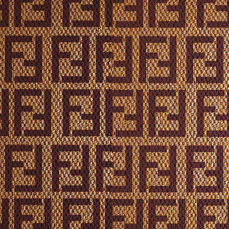
The Fendi monogram design and technical details
The Fendi double “F” logo is another iconic repeat pattern design. It’s also a design that traces its roots back to the 1960’s. I’m not sure if there was something about the designers during this period, or the competition between the brands that saw many of these now iconic marks created, but it was certainly a time of wonderful design that has aged incredibly well.
The Fendi design features two interlocking sans serif, uppercase “F”s. It was created by Karl Lagerfeld, who was the company’s creative director at the time. For me there is something beautiful in the square, bold aesthetic of this repeat pattern. It’s a hard, angular shape compared to many of its contemporaries, you could go as far as to say, brutal or brutalist, which was a movement that had a really significant presence throughout the 1960’s. Yet when it is used as a repeat pattern by the brand it has a softness and sophistication to the shapes it creates, the sign of a great design.
Looking at this from a designers point of view, working with the “F” shape, it is naturally more aligned to being square and that brings real strength with it. A serif typeface wouldn’t have had the impact, and wouldn’t have been as simple, therefore would have reduced the visual impact. This design is another example of the power of negative space, the shapes created by the facing “F”s is a big part of what I find appealing about this design.
The Fendi FF logo applications
The Fendi double “F” logo has also been very widely used. It is highly recognised but tends to be used in a subtler way to what we see from Vuitton and others. It’s worth mentioning here that all these repeats are widely used with a single iteration of the mark within the design also being found within most garments.
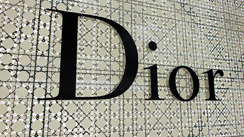
Dior
Yet another design that can be traced back to the 1960’s. The Dior brand pattern is a classic repeat pattern design that features the letters of the company “D” “I” “O” “R” interlocking with one another in a stepped process that initially looks clumsy as a piece of stand-alone type, but when this is repeated, the chaotic elements of the single unit become a mezmerising part of the patterns visual appeal.
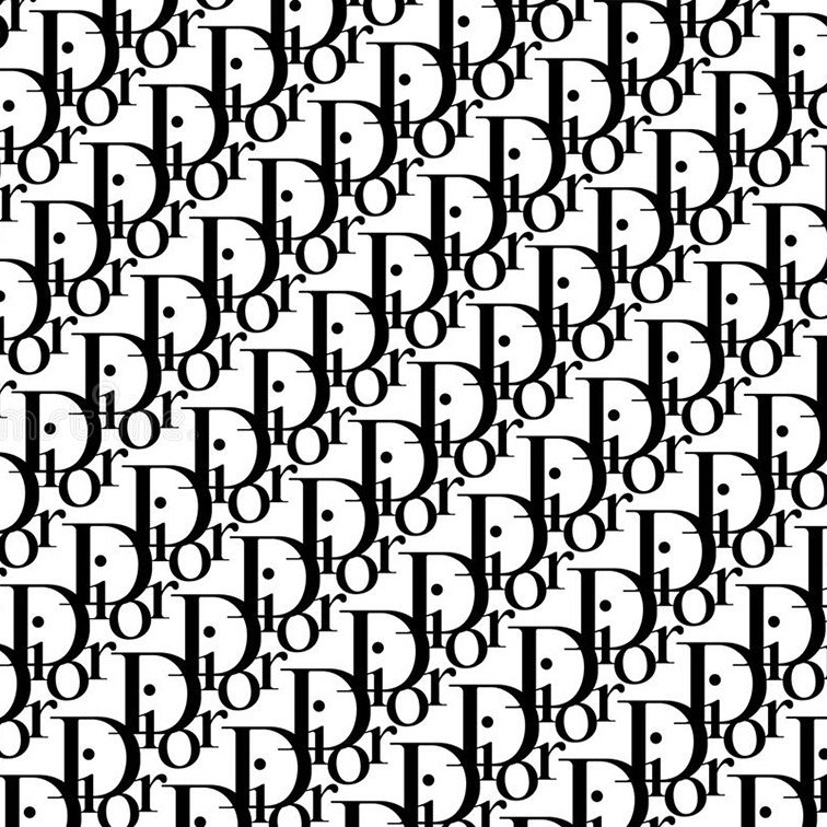
Whilst this repeat pattern is widely recognised, there is another icon of this brand that many would consider to be more… well iconic. The interlocking “CD” which creates a beautiful diamond pattern. This design is ‘clever’ design, let me explain what I mean. I refer to ‘clever design’ as design that works on more than one level.
The multiple interpretations of a mark or icon, for example here there are two levels of connection, the shape could be the “C and D”, but it can also be a diamond. Whichever one you see first, there’s a journey of discovery involved that builds a connection with people. This two-level design is very sophisticated and elegant, hence my description. As a designer, this is the holy grail that you strive to achieve.
The Dior monogram design and technical details
The pattern was created by Christian Dior, the founder of the company. The Dior Oblique ‘text’ pattern has been used on everything from handbags to clothing to shoes in much the same ways as the other brands.
The CD ‘diamond’ has also been widely used, with both versions retaining the status achieved elsewhere by a single mark. That is a huge achievement in any area, particularly within fashion design and branding, it is a clear demonstration of the quality of the designs, their appeal and longevity.
Burberry
Here’s another brand that has more than one iconic repeat pattern design…or I should say it did. I have to be honest, the past decade has seen this brand make some unusual choices that suggest it is somewhat lost at the moment, unsure of itself and particularly unsure about who it exists for.
The ‘tartan’ was Burberry’s iconic repeat pattern. The trouble was it wasn’t policed and the knock-off brigade had a field day. You could argue that this was the ultimate acknowledgement of success in terms of brand awareness. The knock-off’s reproduced the pattern extremely well, which hit the business hard. As a result they pretty much dropped the ‘tartan’ in favour of a new repeat pattern that joined “T” and “B” in 2018.
There have been various reasons and explanations offered about why the brand took this direction, Google it and you’ll find screeds of information, but most of it is personal opinion rather than strategic direction from the business. Then only weeks ago, as I write this, they dropped the “TB” entirely to refocus on the lancer – a big gamble and one that I’m not convinced has been particularly well thought through (LinkedIn post).
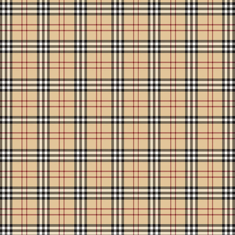
The Burberry check
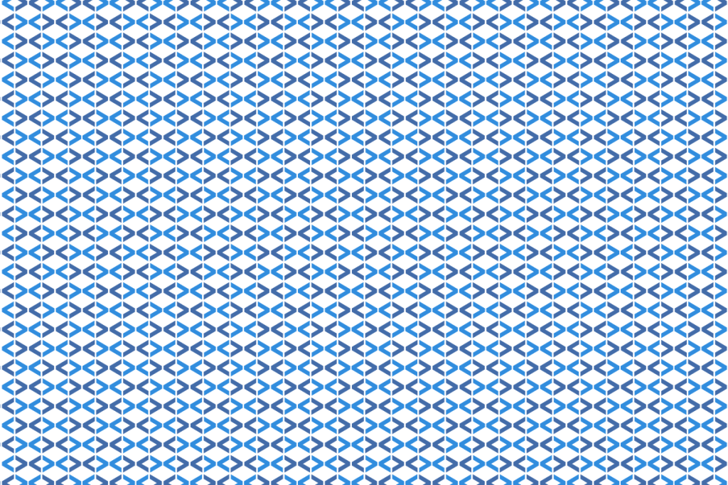
Let’s start with a question. is it a check pattern or a tartan? Depending upon what you read, it is referred to in both ways. Whichever way you chose to describe it, there’s no denying that this pattern is one of the most recognisable repeat pattern designs in the world – hence it being copied so much.
The Burberry check pattern was first introduced in the 1920s and the colours remain synonymous with the Burberry brand. This is a design that features a series of tan, black, white and red lines intersecting to create a tartan pattern. It’s not a tight or close pattern like some of the other examples I have looked at, it has space and air, it blends earthy tones with a striking geometric dynamic that is very eye catching.
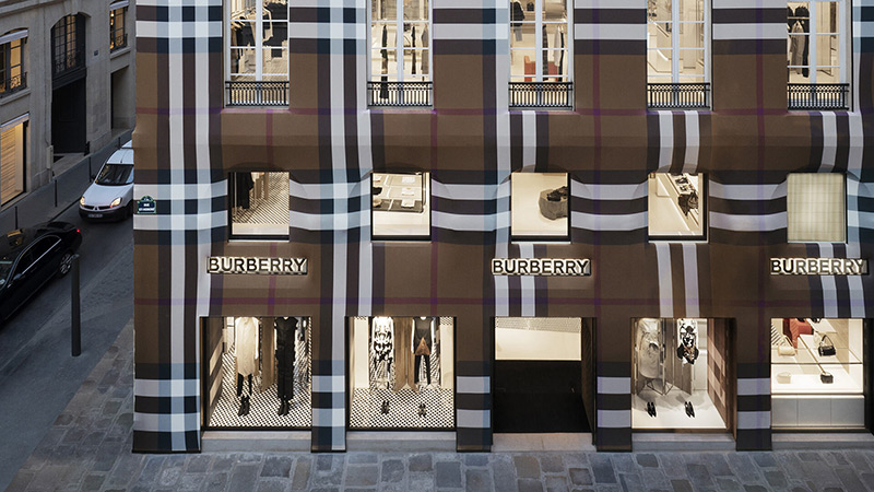
The check/tartan was used originally only as a lining material for Burberry’s trench coats. It wasn’t until the 1960s (that period again!) that the pattern was featured on outerwear garments.
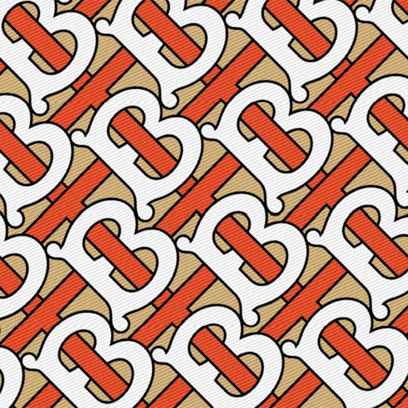
The Burberry interlocking letters
Interlocking letters and fashion, now there’s an original thought (not). In 2018 under the artistic direction of Riccardo Tisci, Burberry created the interlocking TB repeat pattern. I’d love to know the rationale for this? I really would, it’s one of those things that has been explained 100’s of times and everyone is slightly different.
Could it have been that they felt the Thomas part of the Burberry brand warranted being more prominent? Was it a reaction to the continued success of Chanel, Vuitton and Gucci with their timeless monograms? Whatever it was, it certainly wasn’t timeless.
The design is very bold and dramatic, there is a heavy use of black with bold orange and white areas. You could go so far as to say it’s aggressive. I suspect a big part of the motivation was to protect the brand, in the same way Louis Vuitton wanted to protect his bags.
The design is very in your face and shouty, what do I mean? Well there’s a bold, aggressive stance to the angle of the letterforms and the size at which they appear. There is nothing subtle about the pattern and hence any hope of creating a level of sophistication goes right out of the window – that’s my opinion anyway.
When you look at many of the brands within this space, they are usually employing a less is more approach. There’s a good reason for that – it works> People like it and it provides a versatile base within which they can brand an almost unlimited number of items.
So it’s no surprise to see this design now discarded into the waste bin. I really hope the Burberry can reclaim the prominence that they held at the height of the check/tartan pattern prominence, it’s too early to know whether they can bring the consistency of yesteryear back into what they are doing today. Let’s see.
Other repeat patterns of note
As I’ve already mentioned there are lots of brands with fantastic repeat pattern designs, I don’t have the time to go into everyone, but here are a few other examples of work with real design presence and human connection.
Versace
It feels like the Versace Baroque print has been with us forever. There’s a couple of very good reasons for this emotion. First is the design, based on Italian Renaissance and Greek Classical sculpture it is a bold, intricate design that features the ornate swirls of a mythical creature – Medusa. These art movements are considered by many people to be timeless, having an icon that exudes those values is always going to be powerful and feel established.

The second part of the strength within this pattern comes from the consistency with which it has been used and managed. You have to admire the teams at Versace for this and it is a major part of what has made it so recognisable.
The patterns that we see today are much younger than many of it’s contemporaries, being first introduced in the 1990s. Which demonstrates just how powerful this kind of branding is when it is well researched, designed and applied.
Missoni
The Missoni zigzag pattern is a colourful, abstract design that was originally created by Ottavio and Rosita Missoni in the 1960s (What was in the water during the 60s?) And like all the other fashion brands, the pattern has been used on pretty much everything.

What I think is worth mentioning here is what I’ve referred to earlier as ‘clever design’. When your name begins with a “M” a zigzag is probably the simplest way to represent the “M” letterform.
Creating a continuous pattern of them is very striking and a wonderful way to ‘brand’ the garment, or whatever other thing you choose, whilst maintaining a level of subtlety and sophistication. This comes from the scale (size) at which the design is applied. The Missoni zigzag is often used at a relatively small size, which brings sophistication to what could be a burtal and aggressive pattern if used larger.
I believe that the Missoni “M” repeat patterns are a masterclass in colour. They have created some incredibly tranquil colour palettes and others that are anything but, very strong and very powerful. There’s definitely an element of ‘if you know, you know’ when it comes to this pattern.
Hermès
The Hermès scarves are iconic, there’s no other word for them, they are celebrated around the world. The Hermès story is different to everything else that we have looked at, they have taken a different approach to the repeat pattern design element of the brand, choosing not to create one standout repeat pattern. Instead we have a wide range of patterns and styles that have allowed Hermès to explore lots of different themes and artistic styles.
Let’s unpick this a little further, by producing different styles there’s a broader appeal, but that brings with it more challenges, particularly from a brand point of view – where consistency is key – and suddenly you’re trying to be something to everyone which is never a good thing.
So why would you do this? I admire how this brand has developed it’s positioning. Unlike many other fashion brands they have built the Hermès brand around a celebration of creativity and exploration, which I’m sure many other brands have claimed as a ‘brand value’ as well along the way, but choosing not to develop one house pattern and repeat it everywhere is a bold departure. Instead Hermes has focussed on beautiful, creative expressions under the iconic “H” logo, which really does show that there is more than one way to develop a successful luxury, fashion brand.
Emilio Pucci
Emilio Pucci has a very distinct repeat pattern design style. The designs are often described as ‘colourful and geometric’. The colour palette tends to be strong, with high contrast colours and tones. Whilst many of them are geometric, they are not exclusively geometric, there are random and organic patterns used as well.
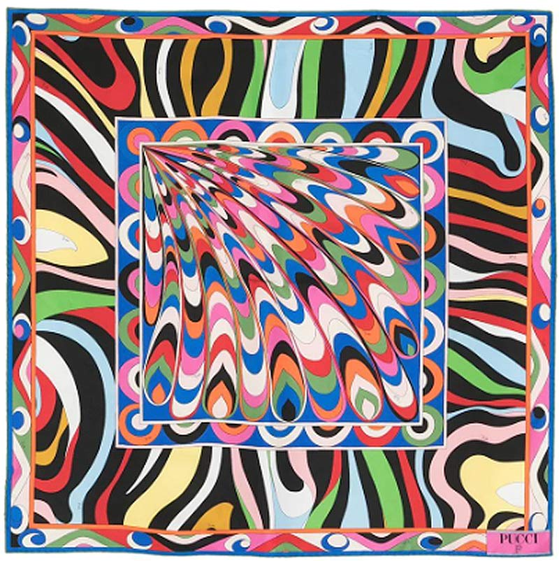
I would say it was the colour palette that most people identify with and whilst there is no branding as such within the designs, the originality of the illustration style matched with strong colours has created the point of difference that is now the brands signature.
The designs were originally created by the founder, Emilio Pucci, in the 1950s. Whilst the prints have, like all the other brands been used on almost every type of object that you can think of, scarves and ties have been the central items around which this brand has developed.
Design impact
All of these designers and their iconic patterns have had a lasting impact on the fashion industry and society. I love that these designs continue to inspire new generations of designers and fashion enthusiasts alike, who each bring their own interpretations and evolutions of the brand with them.
Designing repeat patterns
There have been a few occasions where we have been involved in the development of repeat patterns for clients and as part of Busy as AB’s projects. I’d like to share a couple of examples with you.
The DressCode signature
Having worked with brands for over 20 years, I decided to start my own fashion brand in 2018. I was very clear about who we were ‘talking to’, what interested our audience and as I have already said, I am a big fan of ‘less is more’ design.
The DressCode brand is all about keeping things as simple as possible. First there’s the name, it’s all about Dressing in Code, defining the dresscode. Then there’s the brand mark, “DC”, expressed in the angled brackets of code, because if you know, you know.
Whilst I was developing this identity I was very much aware that there would be a need to create a repeat pattern design, that lead me to the repetition that we use today, called the DressCode Signature, it is a continuous repeat pattern design, very much a geometric design, with the angles of the brackets creating both cohesion and tension.
To date we have used only a few colourways, going forward this is an area where myself and the DressCode team are looking forward to more experimentation.
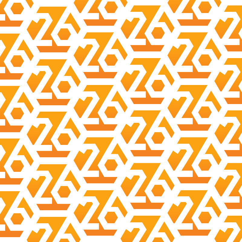
26th anniversary repeat
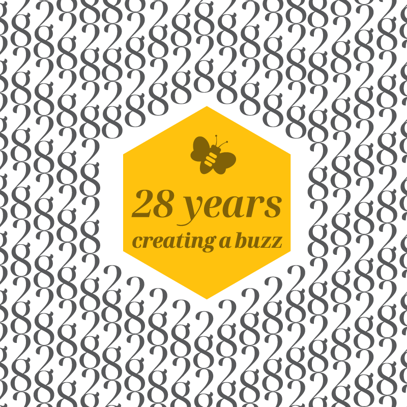
Busy as AB has always been about creativity and productivity, my initials and the values that I share with my team and we collectively share with these amazing creatures have been expressed several ways over the course of time.
To mark our 26th year in business I wanted to create something that reflected the years of experience and creativity that we bring to our clients. Hexagons felt like a great place to start, they are synonymous with bees and honeycomb, they tessellate very well. Next came the challenge of developing letterforms to compliment the shape. Something that might sound simple and straightforward, however there was more involved than you may recognise.
The 60 degree challenge
Hexagons use lines at 60 degrees, the business is 26 years old. The letterforms for “2” and “6” use lines that are typically at 30 degrees from vertical, this is where the challenge comes in.
Developing letterforms that complimented the outer shape. Looking at where the visual dominance lies and as always, keeping things simple and clear. It’s a balancing act, I am very happy with the result, though I do wonder where we will go next, as we click over into 27, though this maybe easier than I think, as the 7 lends itself to the 60 degrees quite well.
What’s the power of these designs?
These repeat pattern designs have been used to great effect across almost every type of surface you can imagine. From tiny details within jewellery to huge building wraps, they are the symbols by which people identify the brand. The piece that speaks volumes, affirming values, expressing the design style and every aspect of the brand, how it looks and what that makes us feel.
Why is this important? Because humans are, and always have been, visual first. We use our eyes to make micro decisions, millions of times a day, vision is our strongest sense the therefore the sense by which we can judge things quickly. As the competition for our visual attention increases, the need to be instantly recognisable becomes more important. These patterns have come to symbolise much more than beautiful design, they are the markers, the visual points of reference of quality, luxury and above all, the communities who we connect with.
AI technology and repeat pattern design
Where once these designs were developed and produced by hand, computers and computer aided design has revolutionised these processes. I still find pen and paper the quickest and most effective early prototyping tool. I can work an idea up quickly and evaluate it’s practicality much, much quicker with pen and paper.
Using the computer brings a level of finish that is professionally very important, but that attention to detail often diminishes the creative input and exploration of paper for me.
As we are currently travelling through a period where algorithms and AI is becoming ever more prolific I thought that I’d ask ChatGPT3 about creating a repeat design pattern…
Can ChatGPT3 create repeat patterns?
“As an AI language model, I don’t have the capability to create visual designs, as I am purely text-based. However, I can provide some general information about how repeat patterns are created.
Repeat patterns can be created by hand or digitally. Hand-drawn repeat patterns involve drawing a design and then repeating it manually, either by copying the design or by using a stamp or stencil to create multiple copies of the design.
Digital repeat patterns are created using computer software, such as Adobe Photoshop or Illustrator. Designers can create a single motif or element, and then use the software to repeat and manipulate the design to create a seamless pattern. The pattern can be adjusted in terms of scale, colour, and other parameters, and the designer can preview the pattern as it will appear when tiled seamlessly.
In general, creating a repeat pattern requires an understanding of composition, colour theory, and the principles of repetition and symmetry. Designers must also consider the intended end use of the pattern, as different applications may require different scales or colourways.
While I can’t create a repeat pattern myself, I hope this information is helpful!”
The last word…
Thanks for reading, if you’d like to know more about any aspect of this blog post and the work that we produce, please get in touch.
