
My recipe for brand success
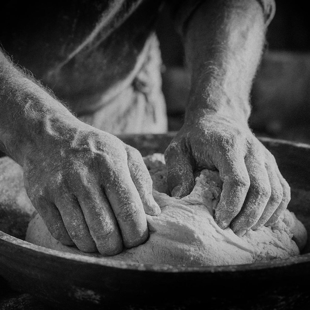
What’s more important? A proven recipe? The right ingredients? Or the technical tools and equipment used to make the dish?
One of the things that brings me great joy is cooking. Having worked with food retailers, food and drink producers and hospitality for a big part of my professional life, I know the importance of good ingredients and having the right tools for the job.
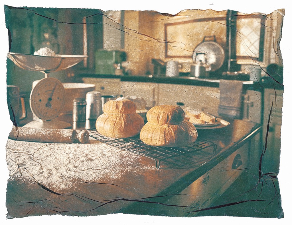
When you look at a piece of food, whether that’s a finished dish or an ingredient, there’s always a back story to how it was produced. What the grower did and didn’t do – the soil, the way it was reared or grown, how it’s harvested, when it’s harvested and lots more. All backed up with years of experience and often a clearly visible (and taste) difference as a result.
In my work developing brands, designing and delivering experiences that foster human connection, there are lots of tools and ingredients at my disposal. What I’m always looking to create is a dish that will satisfy the needs of people. Whilst the vast majority of the product these days takes a digital form, there are a myriad of ways that all of these assets can be created.
Knowing what to do and what not do to
It’s easy to get confused, in fact there’s a new line of thinking, that suggests a lot of these tasks can be done by a machine or LLM, working purely on the information that you tell it, combined with it’s ability to plunder the web, finding resources that it believes are similar to what you want and averaging them into some sort of gloop that answers every aspect of what you wanted.
The theory sounds good, but there’s a lot of interchangeable parts that are being overlooked in this overly simplistic outlook. Real innovation comes from left field, not from creating an average of everything that has come before.
The focus on a fix for the ‘here and now’ can create big problems in the future. Not least evidencing the credentials of the LLM solution, something that is often assumed with little or no proof of successful delivery. And don’t get me started on the environmental impact, this is being hidden away, with no honest facts currently available, about just how much carbon is being created, which is very worrying.
The right tool for the job
Despite my concerns, I’m not about to go into battle with LLM’s and AI generated content. That’s a fight that has been raging for much longer than many people think – ever since humans made marks on walls, in stone and then ink onto papyrus. There’s been this battle for information and the best way to share it, to connect with other people. Some of the more recent examples include the printing press, the internet and social media. These were all stages in a power struggle that started a long, long time ago.
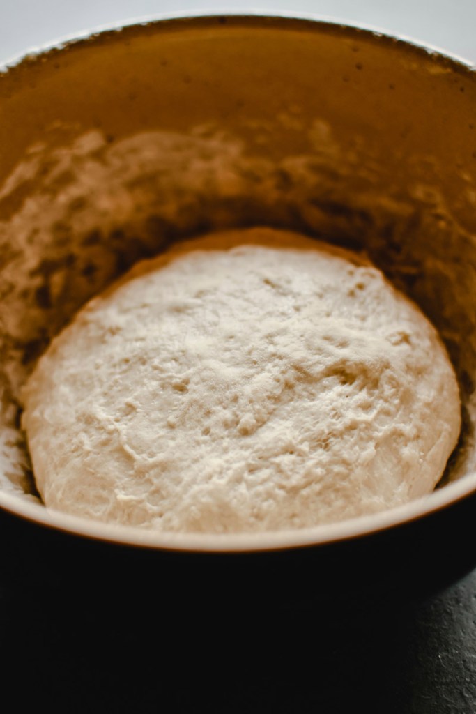
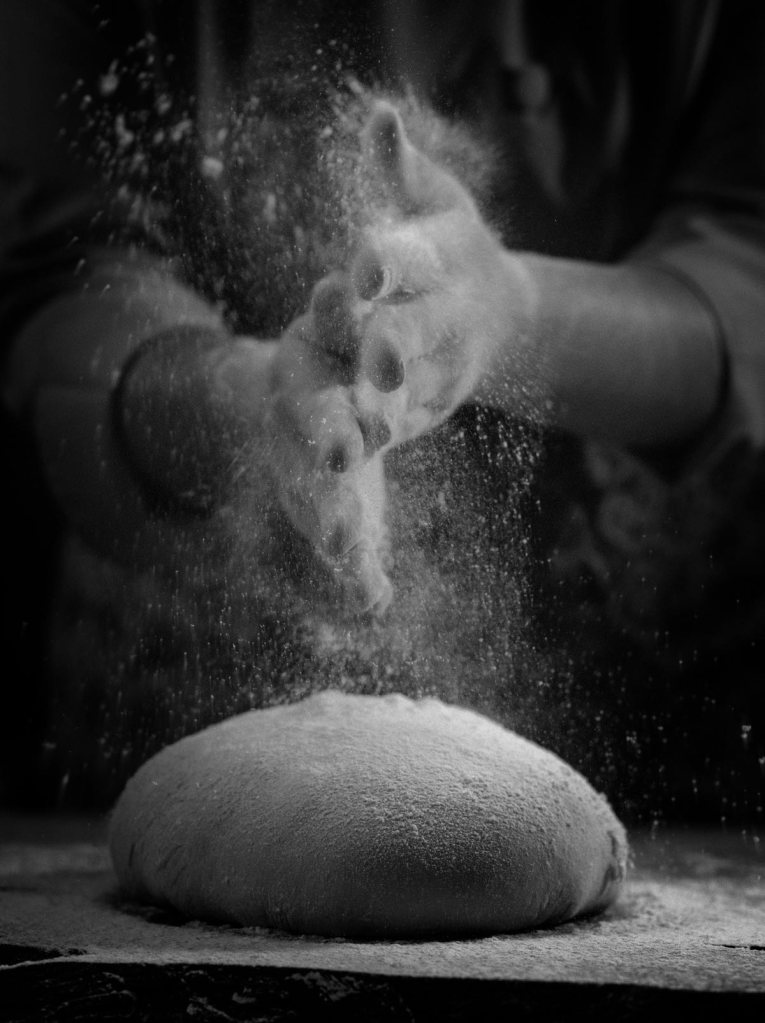
I’ll be honest, my go to tool, for pretty much everything is pen and paper. That may sound old school to some, but for me these tools are unbeatable. The speed at which I can makes notes, drawn conclusions, sketch ideas and developments is unsurpassed by any form of digital technology. This is also my thinking space, away from screens and outside influences. There’s a simplicity, clarity and function that I find incredibly compelling. My ingredients are super simple, like a bread recipe – they are called the basics, so called because they are every day.
What I do with them transforms them into something special. My pen and paper will always be accompanied by a dictionary and Thesaurus – as words and images are totally interchangeable in my opinion. There will always be a brief, or my meeting notes from a briefing session (which have been shared with the client to ensure that we are all on the same page). Briefs and briefing notes are often long, containing a lot of important detail. One of my first tasks after reading or making these notes is to distil the information down onto a single piece of paper – using words, sketches and doddles. This is then placed on my desk with the other tools (mentioned above) and the creative development process begins.
The products of my system varies a lot from project to project, client to client. I’ll be using different experiences, tools and ideas every time.
I’ve worked with all kinds of businesses across many materials and environments from chilled and frozen spaces through to retail set-dressing and display, moving onwards into apparel, signage, shop-fitting and physical space design and flow.
In the digital world, the applications have been even more varied – of course there’s all the usual social channels, but I’ve also worked on large, multi-screen displays at exhibitions, videos, info-graphics, websites and apps. And every project requires different tools in order to create solutions that are fit-for-purpose.
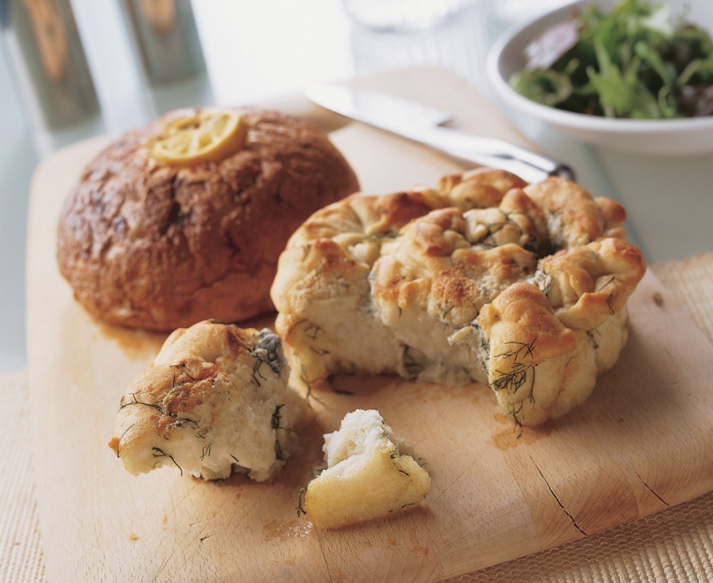
Going back to my bread recipe, when bread is treated with care and imagination it is anything but average, in fact it’s a world away from the gloop that sampling 1000’s of recipes to create an average would be.
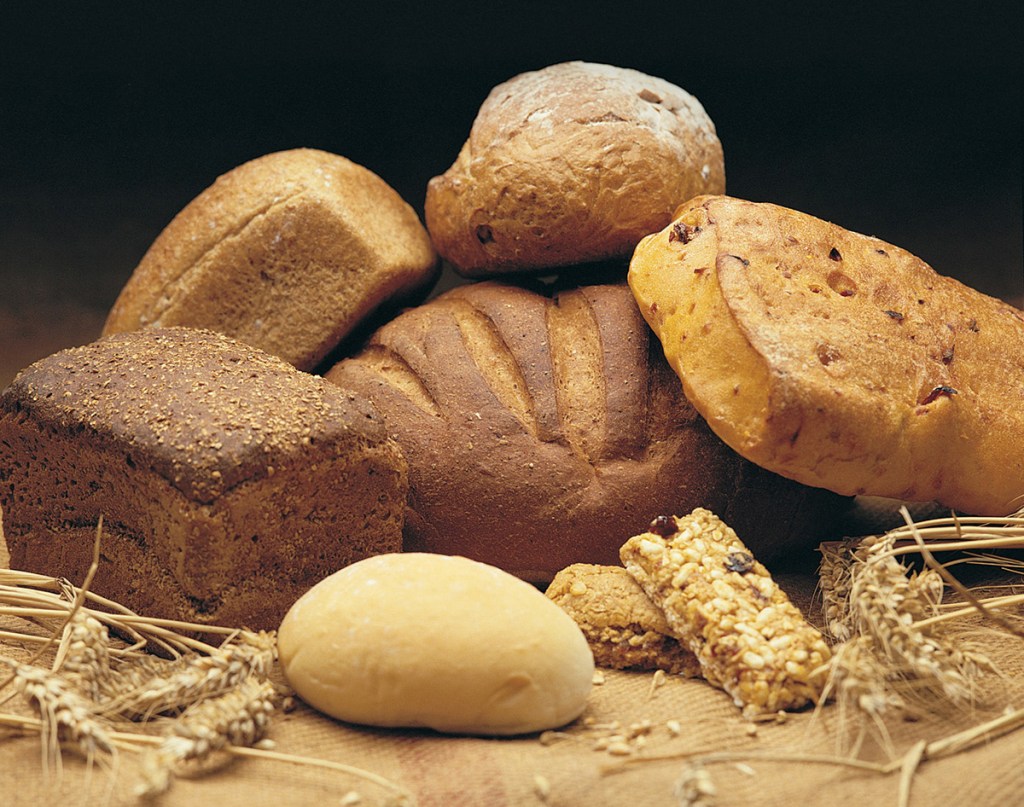
I’m going to admit to having a serious soft spot for bread in my life, and within my cooking, OK it’s technically baking, but all the same principles apply – ingredients, method and then cooking, or baking before eating – yay! I love a fresh loaf and really enjoy exploring the different core ingredients, changing something as simple as the flour or yeast can have a huge impact on the end result. And don’t get me started on the herbs, spices and nuts that you can add in, there is so much opportunity to create a special loaf.
I see a direct parallel in my brand work, as I’ve mentioned, I use a lot of tools from some of the biggest software developers in the world – Microsoft, Adobe, Google and Apple amongst others. Every one of these providers has their niche, and each product has it’s own strengths and weaknesses. So what is the right tool for the job? And why should you care? Will it make a difference to the end product?
Below are a three examples of the ways that using the right ingredients and methodology can have a significant impact on the end results. A lot of what I’m going to speak about is rooted in technical detail and knowledge, other aspects are the result of experience and some of it just comes down to personal professional conduct.
Sodastream – My Soda Mix packaging +++
One of my projects involved very small bottles of concentrated flavour, sold in packs of 3 – which helped give them a better shelf presence. The bottle labels were 38mm high and 54mm long. That is tiny! It will come as no surprise to you that the client brief focused on the shelf impact (due to the size of the packaging) and brand consistency.
The name of these products was given within the brief, the persona’s shared and the design development was a lot of fun. This is a fun product, the client wanted the end result to reflect that and the design direction was soon approved.
As we began the next stage, creating artwork and building brand consistency – the all-important brand consistency and pack architecture shouldn’t be overlooked here.
These assets are the ‘signposts’ by which your customers find you on the shelf – even now, with lots of digital content – brand consistency is crucial across all your media, allowing people to recognise, and connect with your products quickly.
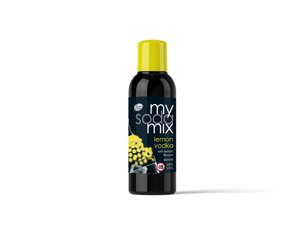
Sorry, I got side-tracked into the importance of consistency there, but I figure you get how important that is?
Back on topic, we are now creating artwork, that means creating master illustrations, icons, typography – there’s lots of things required to make just the label, let alone the way the label is applied to the bottle and how the bottles are then packed and displayed.
The client brief was very detailed, we had a full set of brand guides about logo usage, typography and of course, cutter guides for the labels. I had spoken with the client production team about the print stock and got technical information such as run direction from the printer. ( I did warn you this would get technical and nerdy.)
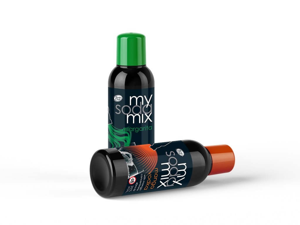
Looking at this through the eyes of the client, they wanted ‘print-ready’ pdf files. They’d even stated that in the brief. There are lots of ways I could have created those teeny tiny labels and passed over print ready files, but before I did that I asked a few questions.
Will there be POS for these products in-store?
Are you likely to run ads in print and digital media for these products?
My reasoning was simple. The approved design had been created in Photoshop, using the layer functions to add depth to the design. I could have produced all the main flavour artworks (8 flavours in total) to the exact size of the label (as per the brief), it would have been really quick and straightforward. So why ask the questions?
I asked the questions because these projects are seldom done in isolation. Effective marketing will always be multi-faceted and that will require assets that are versatile. In this case, the project was to be supported with POS (point-of-sale) items within store and the client confirmed there would also be some OOH (out-of-home – 48 sheet posters/billboards, bus shelters etc) advertising and other media to support the launch.
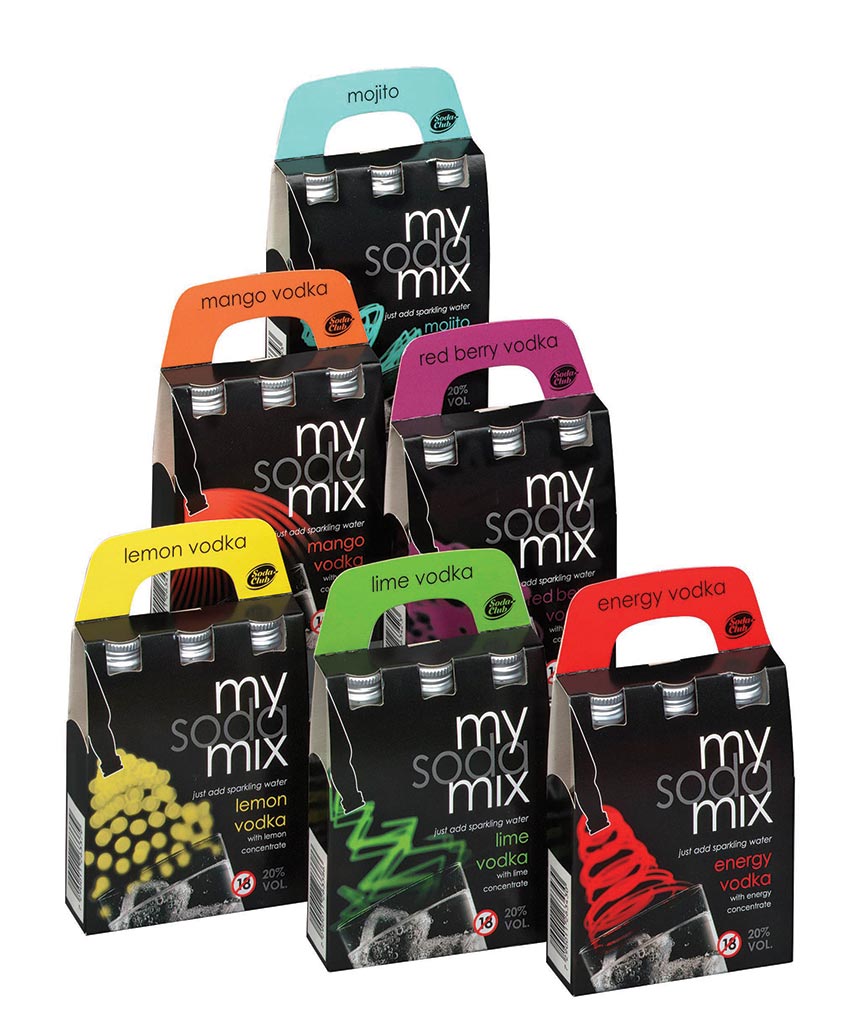
If I’d produced the artwork in Photoshop to the exact size stipulated in the brief, the ability to scale and reuse the artwork files for the other applications would have been nil. I would have answered the brief to the letter, but the solutions that I’d provided would be self-limited.
When I asked the questions above, yes there were some enquiring looks from the client side team. And no, that wasn’t the first time I’d experienced that. I always clarify why I’m asking these questions.
For me, it’s really useful to know the broader ambition of a project, as this ensures that what I delivered was not only fit for it’s current purpose, but also valuable for the other supporting work, saving the client time and money – whether I deliver the additional work or not, the core assets are built in a way that gives the client flexibility and greater value.
Gusto restaurant menus
This is a story of assets that were not fit for purpose. I never did find out why we were supplied with the files in the way we were. That’s another story, for another time.
As a designer you are often given assets and files from other suppliers, through the client brand or marketing team. It’s pretty common practice, usually the client marketing team will hold a set of central files/assets that every supplier uses. It’s a great idea because it ensures consistency, which as we all know, is a major corner stone of building a brand.
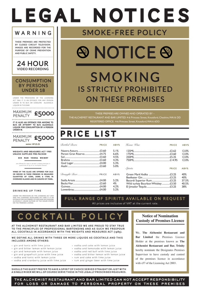
However, it doesn’t always work out this way. One of the projects that I was asked to update was the design of the main menu and associated POS materials for the Gusto chain of restaurants. The client would supply me with the latest set of artwork files and I’d use them as the basis for the evolution work – changing format, running order and looking at the design theme and typography.
We’d had a project briefing and I was expecting to receive pdf files or possibly a packaged Adobe In-Design folder? What I got were Photoshop files. This was unexpected, but what’s the problem I hear you say?
Photoshop was never designed for setting large amounts of type. There’s lots of stuff that it’s fantastic at, but setting large amounts of type is not one of it’s strengths. Any form of editing is slow and cumbersome. The text is never as sharp as vector graphics, because Photoshop works in pixels. I could go on, sorry just need to add this bit because it’s very important – there were also colour issues, the menu was set in RGB, great for screen and digital but useless for physical print.
When I pointed this out to the client they were shocked. They had only ‘used’ the pdf file format within digital comms. Somewhere along the lines a printer had adjusted the colour mode of the file – which sounds simple and straightforward but unfortunately it wasn’t. It could have been, except some of the filters run on the background imagery and textures that had been previously created only worked in the RGB colour model of Photoshop, when you change the colour mode the filters react quite differently and the end result was nothing like it was when the file was working in RGB. That was a problem we’d have to solve. Once the client had got over the shock, they acknowledged that the previous print run had ‘issues’, but they had thought it was a printing error, not the source file.
Thankfully I had a good working relationship with the team. Whilst they weren’t aware of the issue, they understood enough about the technicalities of what I was talking about (and trusted me enough) to agree that Photoshop was not the way to develop the next generation of menu’s and POS materials for the restaurants.
This unpicking and frustration – on both sides – was all totally avoidable, if the right tools for the job had been used in the first instance. It’s often as simple as asking a few questions, finding out what lies on the edges of the brief and how your piece of work fits into the bigger picture – as mentioned above in the SodaStream example. This Q&A process ensures that the end result is not only repeatable, but also the best it can be in terms of access and editability by others in the future.
First Tunnels identity
When I developed the First Tunnels identity all of my design concept work was done on paper. It’s so quick, very ‘free’ and liberating, you’re not curtailed by what an app can or can’t do. You can really explore, uninterrupted by tech. For me, this is great, it will come as no surprise to hear that this is the way that I have always worked, something that was drilled into me at university. The technology, has and will always I believe, serve to add polish (or finish), it cannot create original, creative solutions, not even today.
After the pen and paper stage of course I move over to the computer. And when developing brand identities I use quite a few apps to provide the full scope of brand assets. Typically projects like this will involve four or five Adobe apps alongside some Microsoft and Google apps too.
At the heart of everything will be the central brand graphic, logo or mark. I always create this element using Adobe Illustrator for the simple reason that the asset is completely scaleable. We’re about to get nerdy again, sorry, not sorry! Illustrator allows me to create a vector file. This is important because there is no limit to the size you can take the graphic up to, equally when it comes to tiny icons on screens, a vector file is infinity more scalable in this direction, when you need to go small and retain clarity.
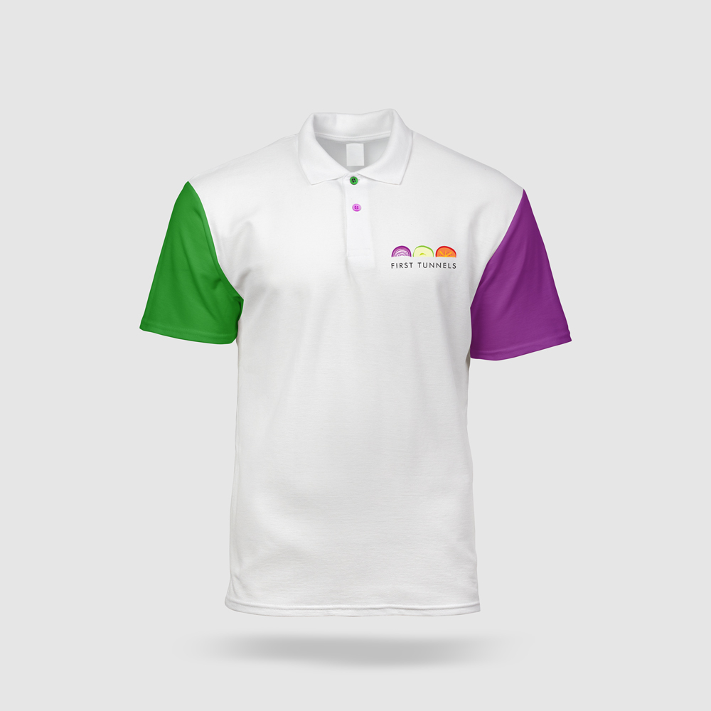
To date the First Tunnels brand identity has been used across –
Digital
Website and blog
Social media
Videos and animations
Quotes and internal documents
Email signatures
Outbound emailers
Physical
Brochures
Stationery
Uniforms and apparel
Books
Signage – large and small
Vehicle livery
Printed magazines
Products
And many more places. The central vector file is versatile enough to cater for pretty much every eventuality.
Why that matters
I believe that it’s part of my duty of care, when working with clients to offer ‘best practice’ by default. Part of that best practice involves value for money and sharing my professional experience.
So I will always ask questions around the edges of the project and the briefing documents. This way I am informed about the best tools and processes for the job, able to support my clients without them incurring additional cost for re-formatting or adapting.
For me this is second nature, it’s what I feel comfortable with, as I want the end result to be the culmination of great ingredients, processes and experience. Going back to the bread analogy, I’m always mindful of fitting the right tools to the job, I mean there’s no point taking an artisan loaf to a child’s tea party, they want the softest, lightest white bread imaginable. The sort of thing that you’d never eat with home-made soup.
Over the years I’ve developed a pretty accurate sense for this sort of thing, and it’s always something that I ask about during a briefing or exploration meeting. Aligning wants and needs with practical, cost-effective solutions is an extremely important part of my process.
To circle back to the initial question – Hand-made or machine mixed? They both have their place. What’s just as important? The ingredients, methods and tools (or apps in my case).
How you create brand assets will significantly impact the outputs and cost of production. Over time, delivering projects I have built up ‘the knowledge’ as the London cabbies used to say, able to read the room, ask the sometimes awkward questions and ensure that what I deliver is not only an original creative solution, but a solution that is versatile, able to live and evolve.
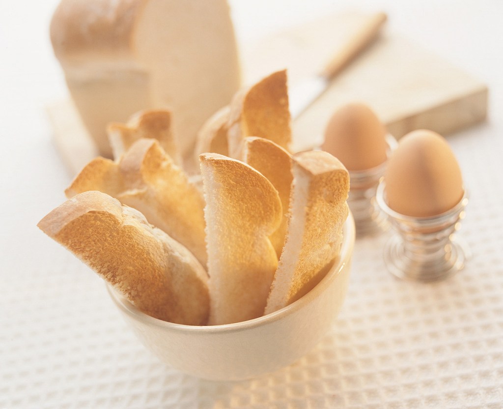
And whilst I love a hand-made focaccia with thyme and olives, I’m equally happy with a slice of white bread to dips in my soft boiled eggs. It’s all about fit, creating the right thing for each business. I call it ‘creating a buzz’ and if you’d like to know more, I’m always happy to talk shop, hit me up for a discovery call. Thanks for reading.

