Watering down a brand is not something that you’d usually hear anyone advocate…however there’s always exceptions. And here’s one that certainly benefited from being a bit more diluted.
The name SodaStream (SodaClub if you’re in Europe) for anyone who can remember the 80’s, instantly creates images of brightly coloured, fizzy drinks and the associated stickiness of the sugary syrups that came with the drinks machine of choice.
‘Get busy with the fizzy’ is still recognized over 30 years later! Most brands would kill for this kind of brand recognition, but the world of soft drinks has evolved a lot over that time, bottle water and the desire for healthier options has never been more prevalent.

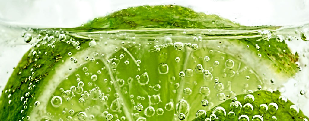
Water – still, sparkling and flavoured is a massive market. Statista quotes global comsumption for 2017 at 391 million litres. Water is not an easy product to brand, I’m sure a lot of people in the UK will remember Dasani – for all the wrong reasons! Today there’s another big problem, that the faces every brand – the packaging. The plastic bottles that hold the elixure of life for some, are a death sentence for others. There are over 20,000 bottles purchased per second!!!! – Check out these infographics from the BBC.
![]()
I worked with SodaStream a few years back, at a time when the business knew it had to change in order to survive – new investors, Fortissimo, saw potential. They recognized that no-one wanted to give their kids…or anyone else, a product laden with sugar/sweeteners and E-numbers all wrapped up in day-glow colours.

What’s really nice about SodaStream is the ability to stop consuming the plastic bottles. It’s also fresher, as you can make sparkling water whenever you want it, fresh from your tap. But therein lies another problem, it’s a system, there’s an element of faff and preparation that has dogged water filter businesses for years.
![]()
I’m not going to pretend there weren’t issues, I’ve already talked about some of the background and brand heritage, but what about the global leaders – Evian, Volvic, San Pellegrino and others. All huge players in their own right, and each one a direct competition for SodaStream.
![]()
Whatever the next step was, it was going to take time to shake off the negative images of the past, connect with the environmental credentials of the time and teach people about the system – that’s not as faffy as you might think! There was a lot of work to do, but nothing could be moved forward until the brand’s mark had evolved to be in-tune with the times. The existing swoosh of bubbles through the intense yellow, orange and red said all the wrong things about the brand and where it was heading.
![]()
It needed to be more natural, and the focus was very much on adding (and controlling) the level of bubbles. The natural elements were reflected in the positive, warm and welcoming tones of blue. Then there was the font, the heritage brand used a custom script, the new products were more minimalistic in their appearance, which required a less is more approach. The typography of the brand needed to reflect this as well. And then there’s the bubbles, an intrinsic part of the brand and something that needed to remain. We expressed the bubbles with a very different dynamic, less jet stream more growing and evolving, an element that could be intensified to suit personal tastes, read the full case study here.
![]()
Like many brands the mark has further evolved in recent times – nothing to do with us. But I’m pleased to see that the ethos of the work we produced remains part of the brand today.
![]()
Sodastream is just one example of the work we produce, the research, thinking and development that sits behind what you might see as a customer.
Our work always centres upon the same statement, “Is it human?”
All our work seeks to create rich, human connections between people and products or services. If you’d like to know more about what we do, contact us.
